A personalized, responsive advice app
a UX/UI Case Study
Project Overview
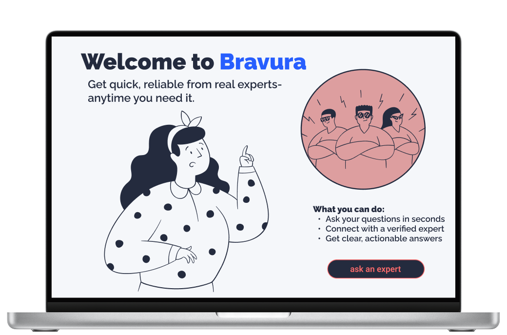
Bravura is a conceptual, cross-platform solution designed to bridge the gap between user curiosity and professional expertise. In an era of information overload, the platform provides a direct line to verified specialists across health, finance, technology, and personal development—empowering users to transition from uncertainty to informed action with on-demand, reliable advice.
The Problem
Traditional methods for advice are slow and inconvenient. People need reliable, personalized advice but often struggle to find credible experts, vet their qualifications, and schedule a convenient interaction. Additionally, most sites and apps offering expert advice tend to be very specific or in niche topics, Bravura solves this by providing direct access to a wide spectrum of verified experts, simplifying decision making through clarity, confidence, and speed.
The Solution
Bravura provides a curated marketplace of verified experts, offering various consultation formats (e.g., chat, video call, asynchronous Q&A) with transparent pricing and scheduling.
Initial Hypothesis
If users are given instant access to a wide range of verified experts through an intuitive and trustworthy platform, then they will feel more confident making decisions in uncertain moments.
Role: Lead UX/UI Designer (Concept)
Timeline: January – October 2025
Context: Independent Product Design Case Study
Core Focus: End-to-End UX/UI Design, Information Architecture, Trust Architecture, Responsive Frameworks
Strategy
When designing Bravura, my aim was to keep the design process in the forefront of my mind to create an app that supported intuitive UX/UI elements and interactive design. My strategy focused on these core pillars:
human centered design→every decision was rooted in the user’s emotional and practical needs.
trust→users need to feel safe in asking for and receiving advice
quality→answers to questions need to be accurate and truthful
transparency→users need to understand what they are paying for and what they are getting in return, reinforcing trust
By combining research, usability testing, and iterative design, my goal was to create an app that was friendly and trustworthy, allowing users to enhance their decision making capabilities.

EMPATHIZE
Competitive Analysis
To differentiate Bravura from the competition, I conducted an analysis of JustAnswer and Quora to identify areas where I could improve upon the short comings of what is offered by these sites. What my analysis found was that JustAnswer lacks transparency within its pricing structure, has hidden fees, and a difficult and deceptive cancellation process. On the other hand, Quora is free, but lacks accuracy and credibility with the advice that it offers. Both of these are trust issues, complicating and weakening their relationships with users.
To juxtapose, Bravura emphasizes transparency in its pricing structure and presentation, with advice being accurate and experts being vetted and certified to create a trustworthy bond with users. Additionally, by removing unnecessary clutter and noise from the interface, the design offers an intuitive and rewarding experience, further strengthening trust and retaining users in the process.
Methods
-
To get a full overview, I analyzed the competition, specifically JustAnswer, Quora, and ADPlist. I looked at their strategies, market advantages, and marketing profile. This allowed me to see how they communicate and what they value as important.
-
I conducted a SWOT analysis
to identify strengths, weaknesses,
opportunities, and threats. This helped me to discover where Bravura could differentiate itself and stand apart from its competitors, and ultimately led me to identify the above attributes. -
By analyzing the UX design of these apps, I was able to identify user pain points and where the design was unfriendly or fell short. I scrutinized the layout, usability, navigation, compatibility, differentiation, and CTAs to help strengthen and inform my own decisions once it was time to start wireframing and gave me insight on how to create a user friendly and intuitive flow for my own users.

Key Takeaways:
Most advice apps tend to lack:
a process to verify the factual correctness of the information being given, especially in a crowdsourced platform like Quora
a way to prevent a wide swing in the depth, usefulness, and professionalism of the responses
a filter for superficial, self-promotional, or generic “cookie cutter” responses
upfront clarity on fees, especially regarding subscriptions, memberships, and additional charges for special features (phone calls on JustAnswer)
straight forward, low-friction steps to cancel memberships
a business model that aligns the platform’s profitability with the user’s success
a system that guarantees the active and current credentials of the expert
a tool to hold contributors accountable for providing bad, harmful, or generic advice
technical and design quality that fosters trust; bugs, poor calendar functionality, and clunky UX undermine the credibility of a platform meant to provide trustworthy expertise
a model that supports genuine, long-term, and continuous relationships rather than one-off, transactional Q&A sessions
built-in features for follow-up questions, progress tracking, or reminders to encourage users to implement the advice received
the ability to easily maintain a history of the user's background, goals, and previous advice received across multiple sessions or interactions
User Research
To better understand what real users would want from an advice app, I conducted initial rounds of user research in the form of in-person interviews. I began by defining clear research goals to understand how people go about receiving advice, more specifically from an online platform, and what they would want from this experience. After my interviews, I used the answers to populate an affinity map to better understand and categorize the most essential user needs. What I found was that most users desires aligned with what Quora and JustAnswer lacked; mainly a transparent payment structure, vetted and certified experts, a wide range of topics, and trustworthy advice. By synthesizing competitive intelligence and user research, Bravura delivers a sleek, frictionless experience that redefines the digital advice landscape.
Methods
-
To help me understand what real people would want from an advice app, I conducted in-person interviews. Using a script and clearly defined research goals, I was able to direct the questioning in such a way to gain insight into how the design should start to take shape and what important features to include.
-
After collecting the responses to my interview questions, I used Miro to categorize each participant’s answers into a color coded affinity map. This helped me to visualize what was most important and to define the main themes and features of my app.
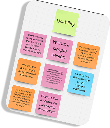
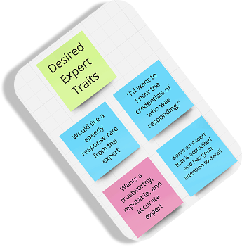
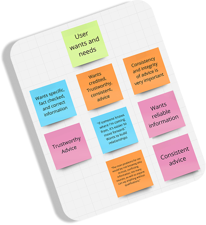
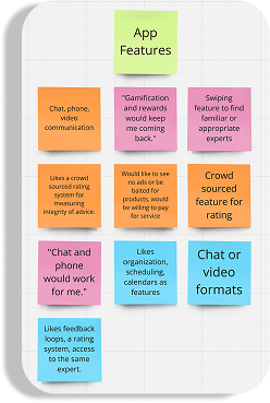

Insights:
users want trustworthy, reliable, and speedy advice
they want experts to be certified in one way or another
categories of advice range across a wide degree of topics.
users regularly seek out advice on the internet or through an app
users would like to build relationships with experts and work with the same people on a continuous basis
users mostly worry about conflicting, unreliable, unspecific or too much information and the integrity of the advice
users want a simple, user centered, and easy to use interface that can be used across multiple platforms
users would like a rating system for experts
they would like some gamification and rewards system
they would like chat, video, and phone access to experts
a calendar or scheduling system would be helpfu
DEFINE
User Personas
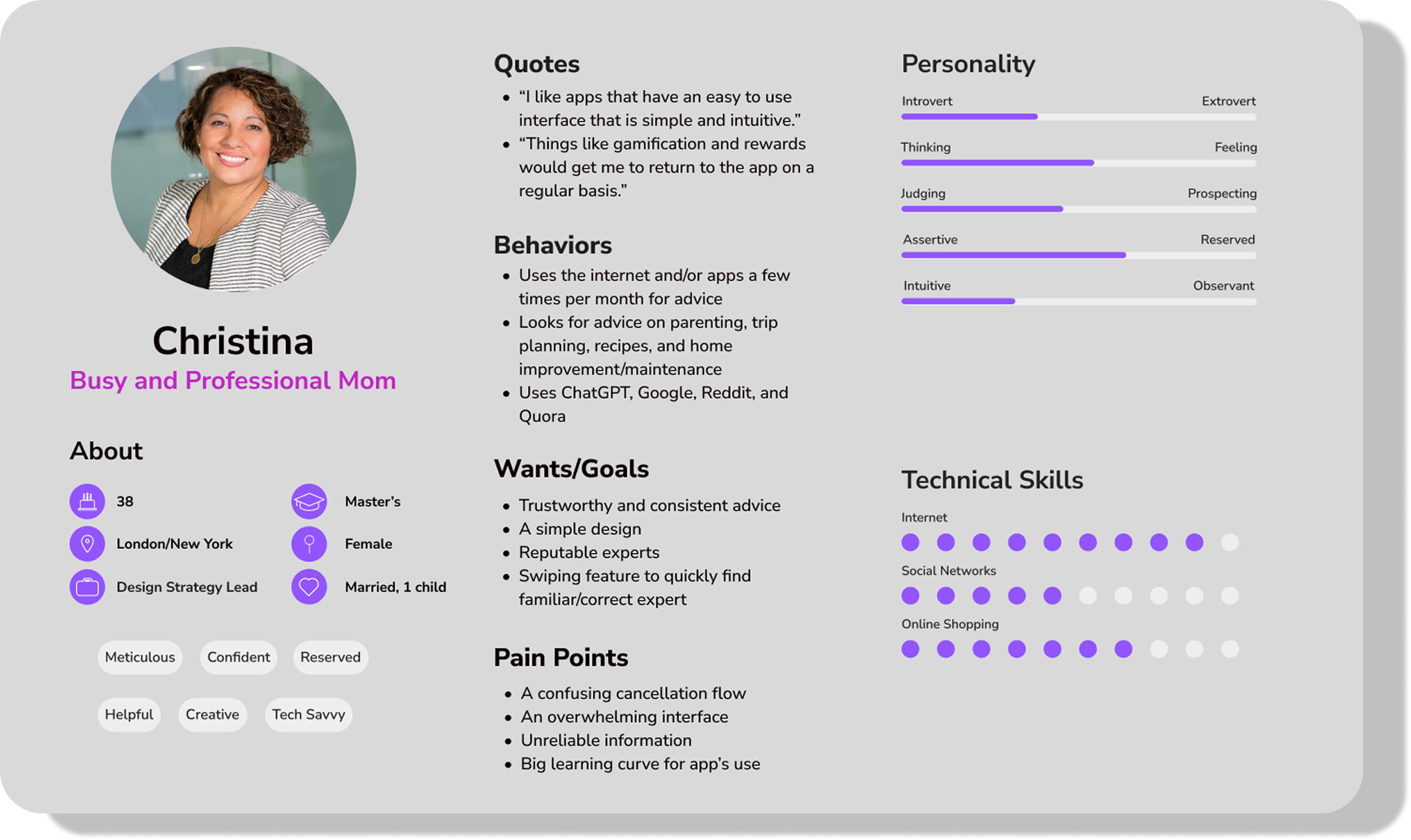
In order to keep the focus on the user, I created user personas to help build empathy around the app. Although fictitious, these personas are based on the responses I received during my interview sessions with actual people, making them feel realistic. In addition to building understanding and empathy, the personas help to guide design decisions, aligning teams and stakeholders in the process. The personas will also hopefully help to avoid any design pitfalls, such as designing for the team or getting too specific for one type of user.
Identities
-
Christina is a married professional with a small child that balances her time at work and with her family, either at home or on vacation. Her powerful career splits her time between New York and London, so she is constantly on the go, and maintains two apartments.
-
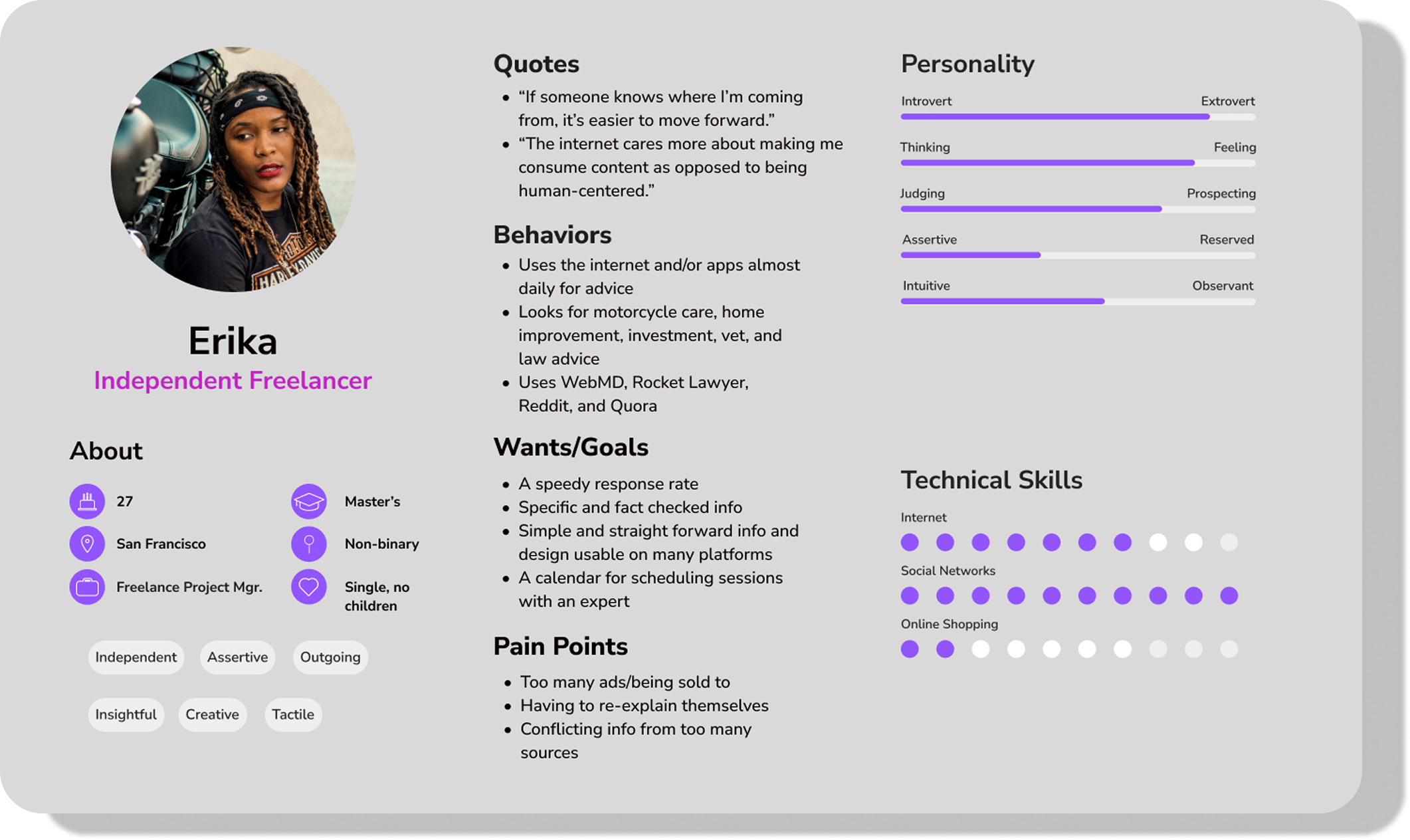
Erika is a single, independent freelance project manager. Her career offers her a lot of freedom and she likes to work on and ride her motorcycle. She recently bought an old house that she is remodeling by herself. She is also a lover of animals and has two brown boxers, George and Martha, that accompany her wherever she goes.
User Journey Maps
Using the personas I created earlier, and the concerns of real people that I uncovered during my research, I created user journey maps to further cultivate a feeling of empathy surrounding the features of the app. This visual tool is intended to illuminate a deeper understanding and familiarity of how users may interact with the interface. By excavating the emotions of the user personas, I was able to identify and correct any pain points early to avoid any abrupt interruptions or expensive fixes late in the design process.
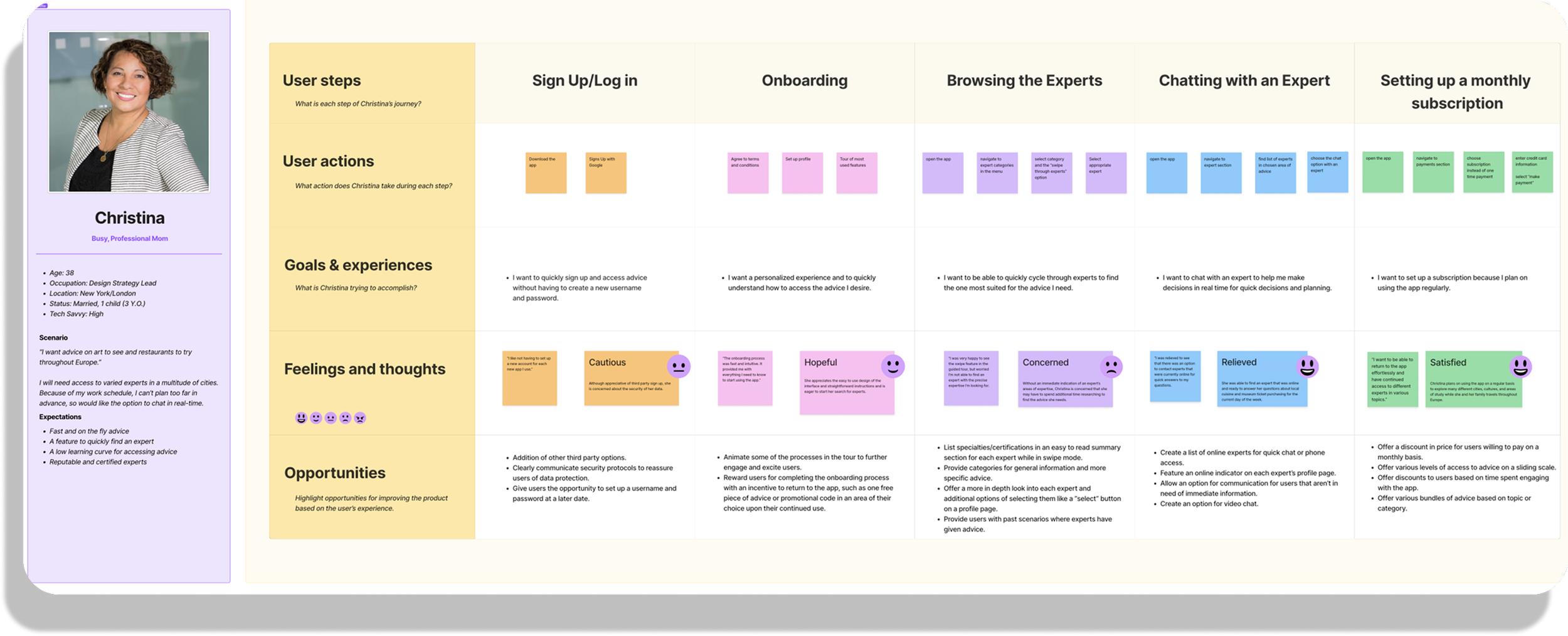
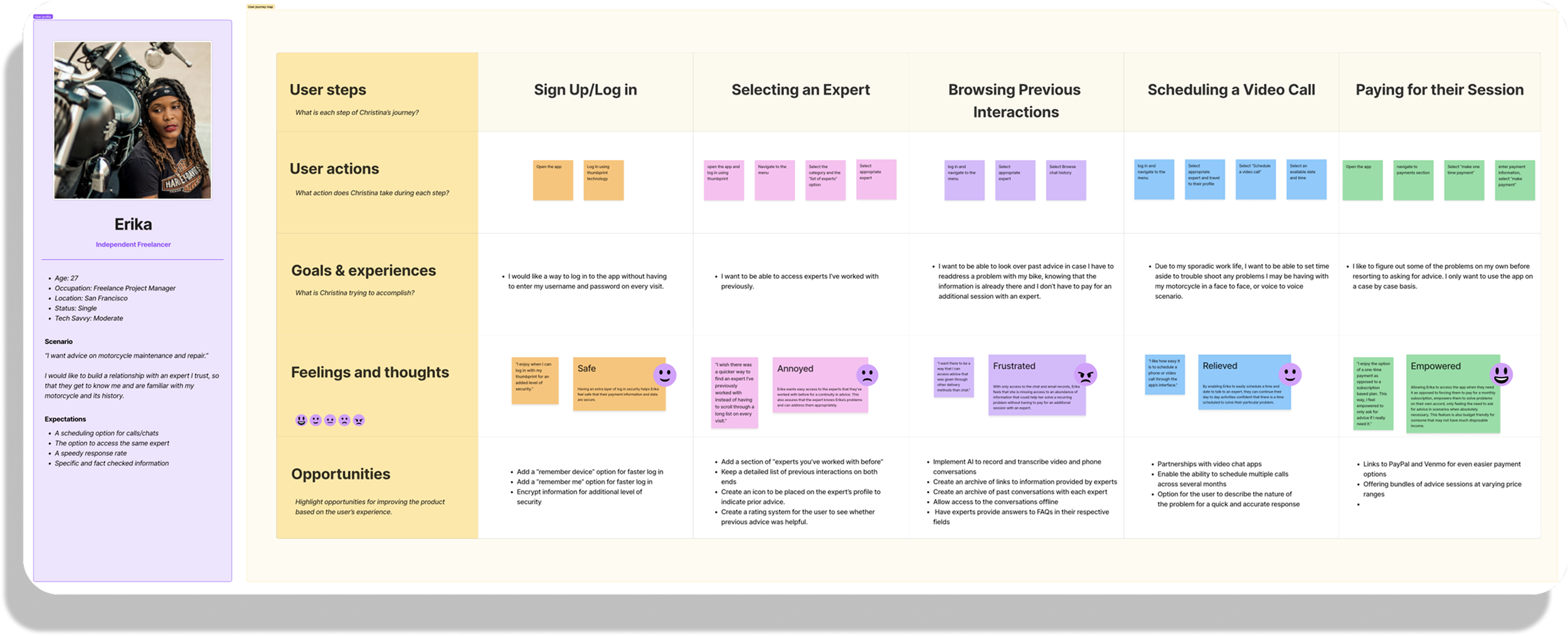
By interviewing real people and noting their concerns and desires, I was able to create user personas that represent a wide range of users, and our target audience. By addressing these insights, Bravura can offer features like a stream lined sign up and onboarding process, ways to categorize and select experts, and a way to view past interactions. Not only will users be able to communicate with professionals in a variety of formats (video, phone, messaging) they will have options for payment and level of commitment.
IDEATE
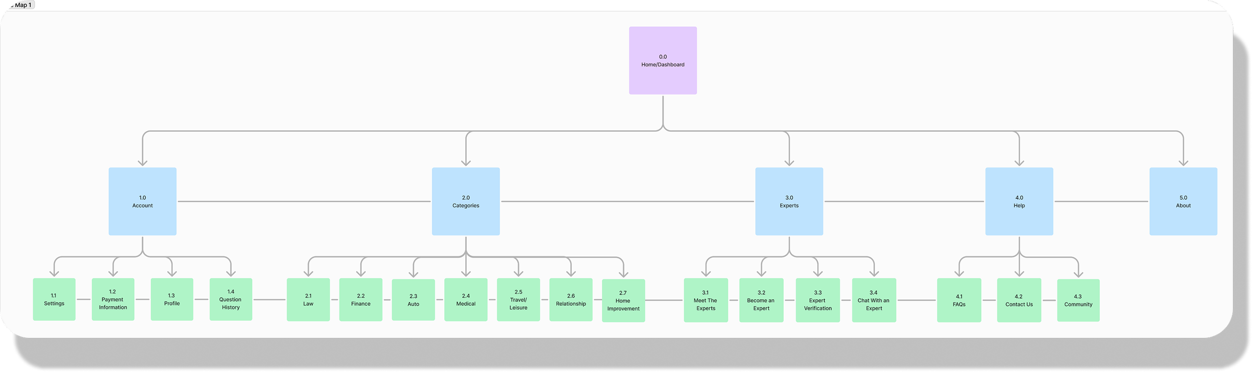
Site Map
Laying out the site map allowed me to get an idea of how the informational architecture of my app will function. By visualizing its hierarchy, I was able to ensure the structure was logical and intuitive. While I knew that I would continue to refine and iterate on this original road map, it was imperative to start with a sound foundation. Besides helping me to identify redundancies and gaps, it also provided a check list of content to focus on.
Original Site Map
Updated Site Map
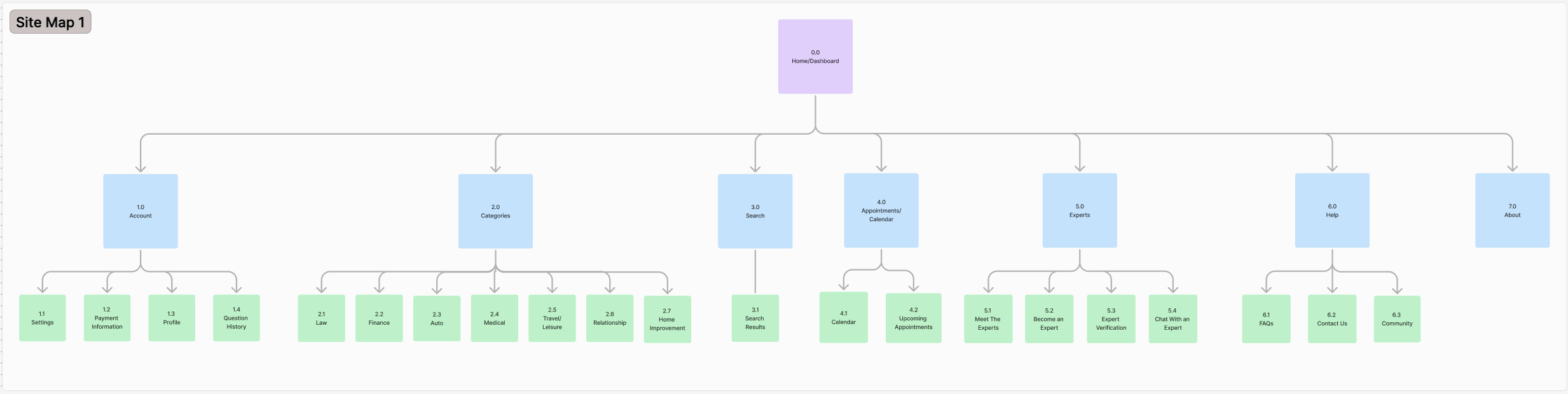
After a review of the first site map and a card sorting exercise, a few minor changes were made, like the inclusion of a search function. As the overall hierarchy continues to evolve with the addition of functions and features, the foundation of the initial structure persists.
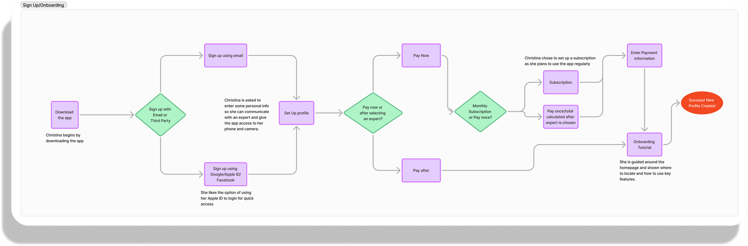
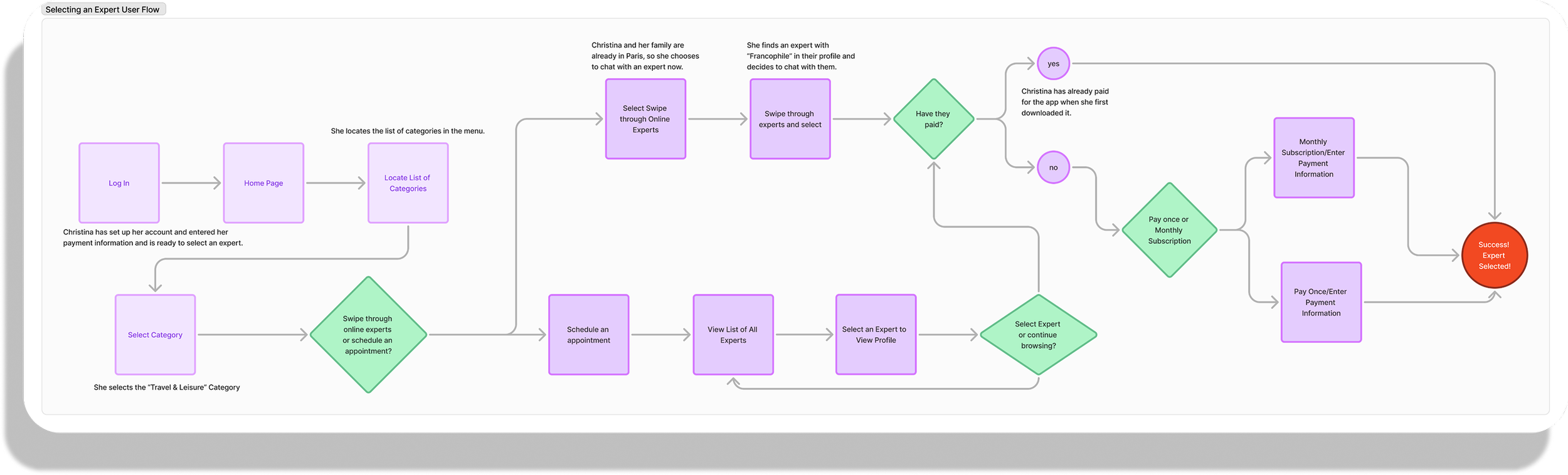
User Flows
After constructing the site map and using the user journey maps as a guide, I created and analyzed some tasks such as onboarding or selecting an expert for potential users to accomplish. Imagining each step of the process, I then transformed these into user flows which provide further strength to the foundation of the app’s information architecture.
Sign Up/Onboarding
Selecting An Expert
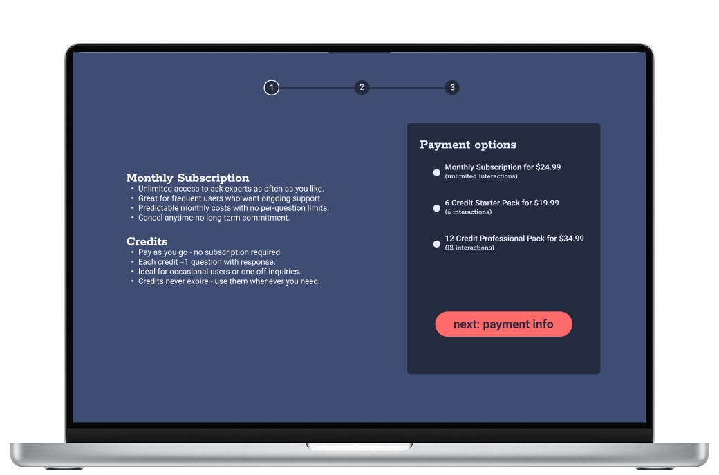
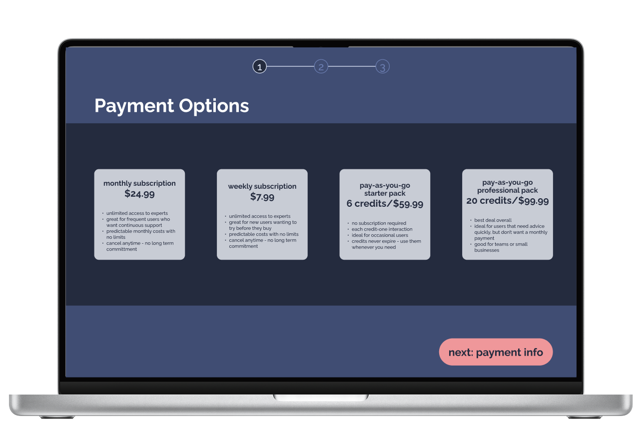
Setting Up a Monthly Subscription
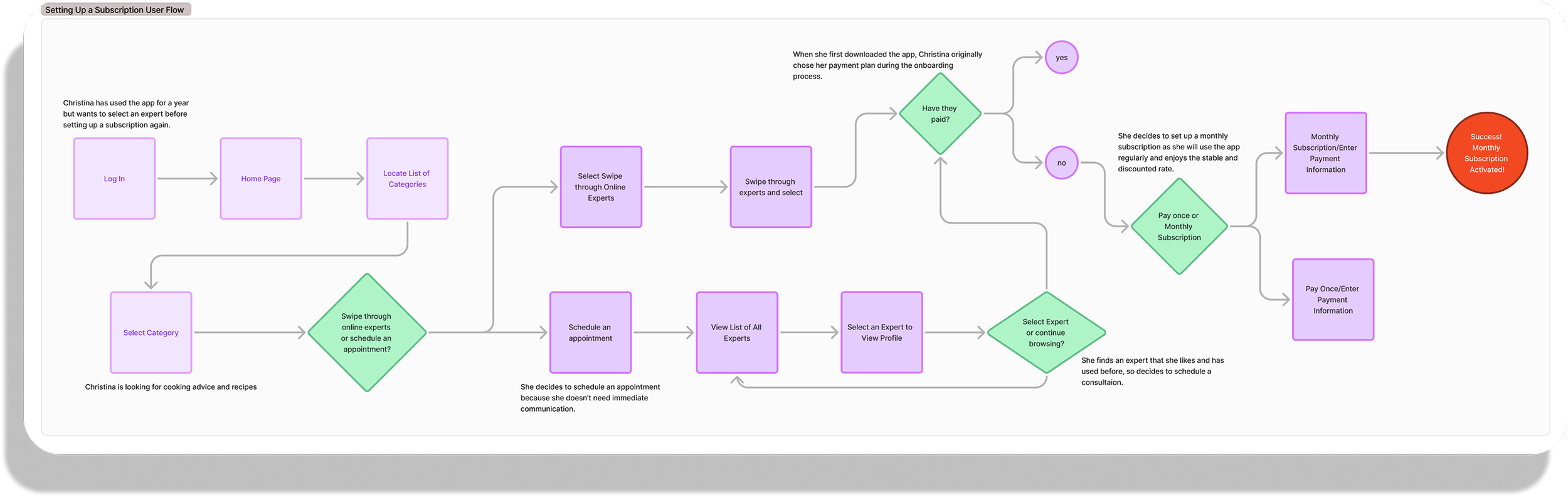
The site map and user flows allowed me to focus on both the macro and micro elements of the design, while the site map focuses on the information architecture and helped to define the overall structure and hierarchy of the product. The user flows focus on user behavior and help to define the smaller specific steps of users’ goals.
PROTOTYPE
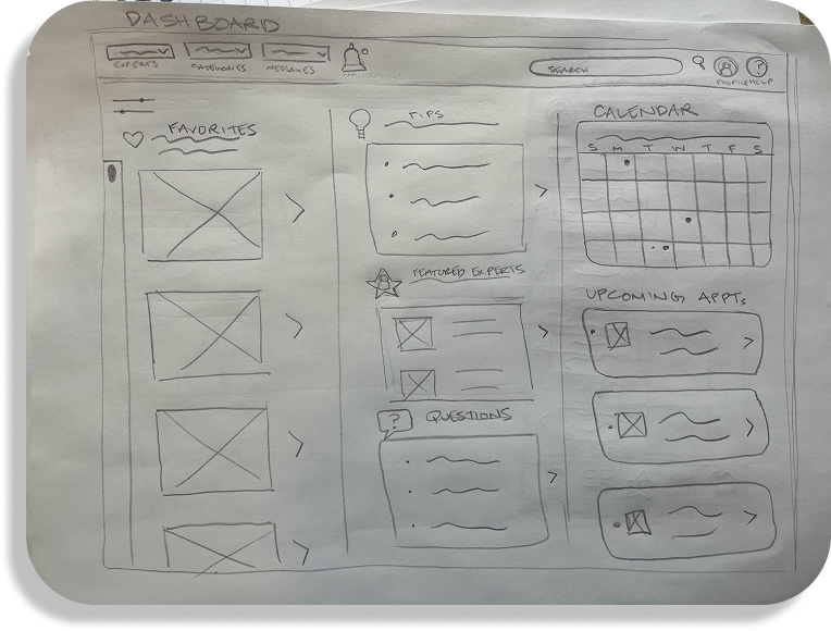
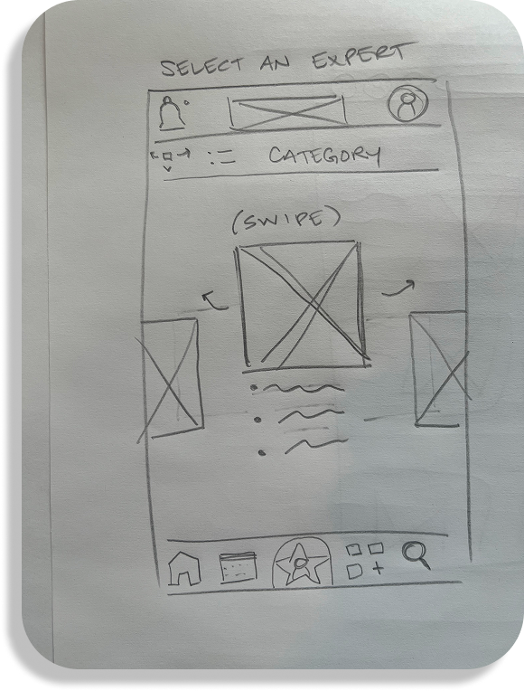
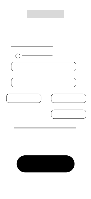
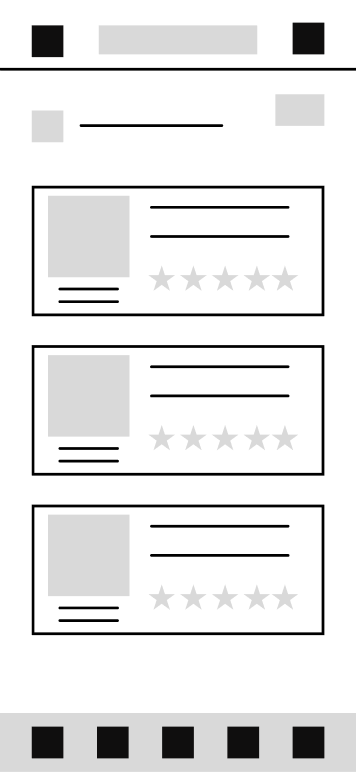
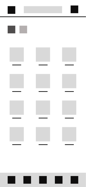
Low-Fidelity Wireframes
At this point in the process I was able to gather all of my research and brainstorming and begin to filter them into the visual elements of my design. Using a process called rapid prototyping, I started with simple, hand drawn sketches with pencil and paper to quickly spew out any ideas I had knowing further refinement would come later. I then translated these analog sketches into a digital format using figma, further fleshing out the structure. Here, the the goal was to validate layout, flow, and content hierarchy without distraction. Grayscale wireframes with placeholder text and icons were used to focus on structure and navigation paths. Components like buttons, cards, and input fields were blocked out to test user journeys and screen balance.
Desktop Pencil & Paper Sketches
Mobile Pencil & Paper Sketches
Low-Fidelity Figma Wireframes
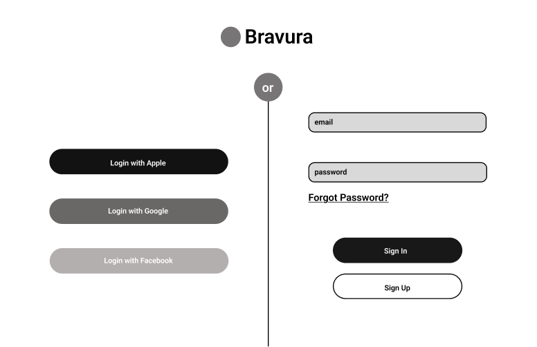
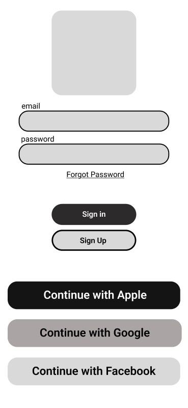
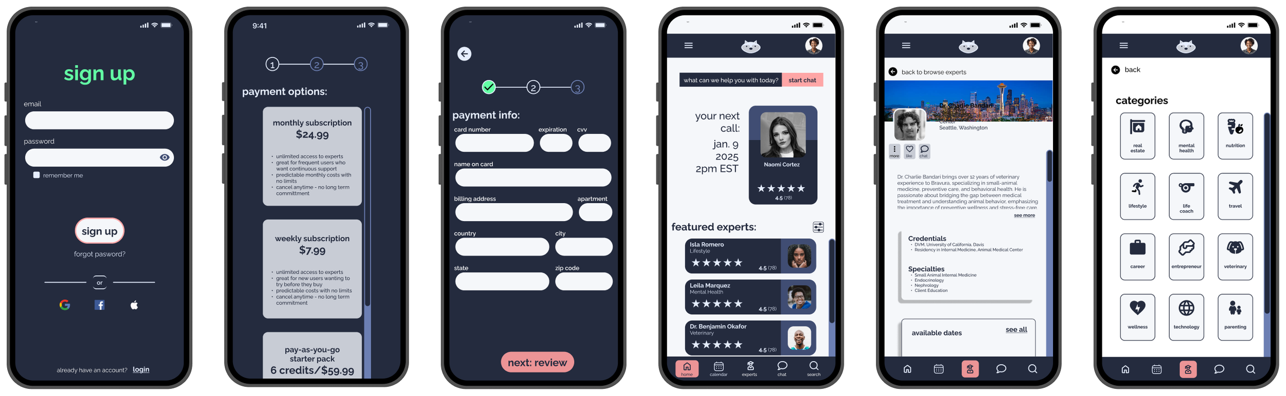
Login

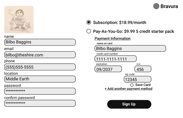
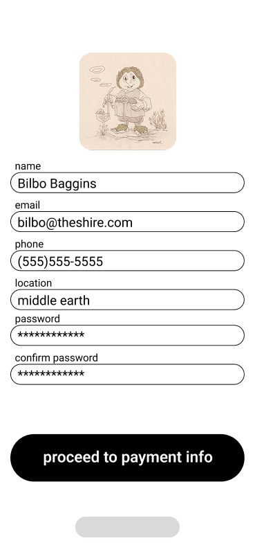
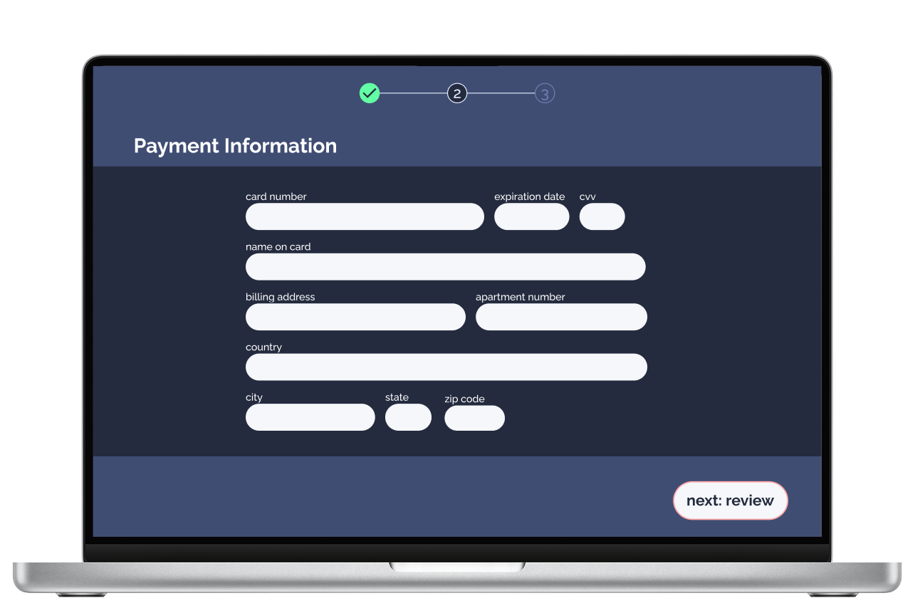
Sign Up/Payment Info
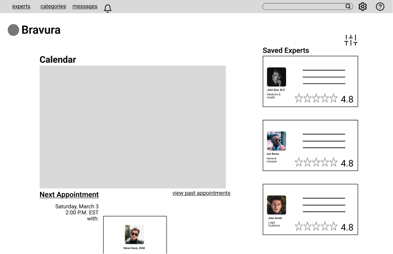
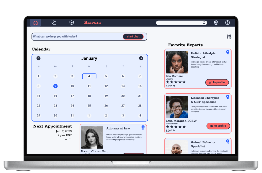
Dashboard
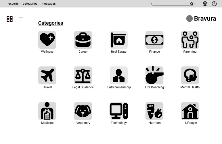
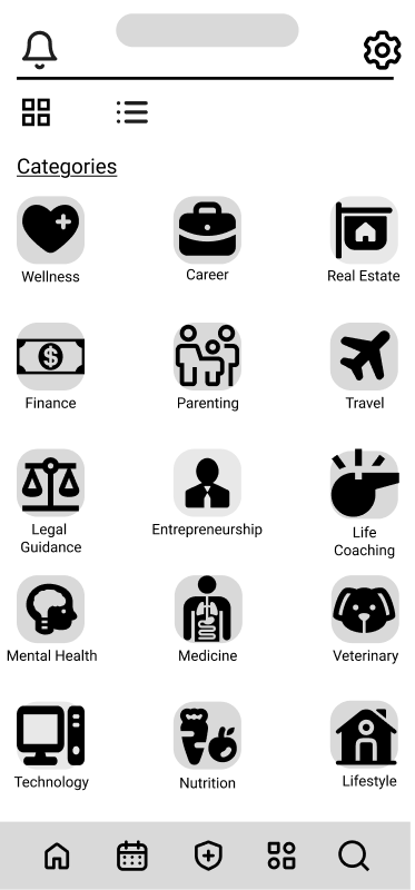
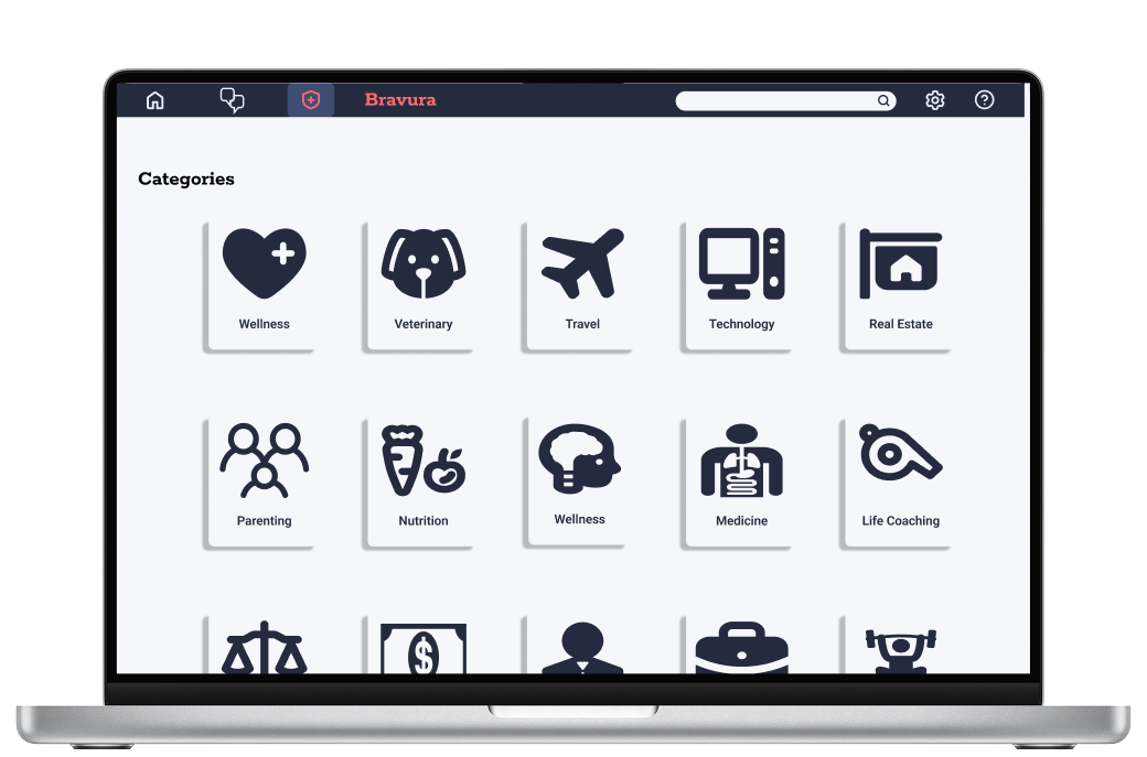
Categories
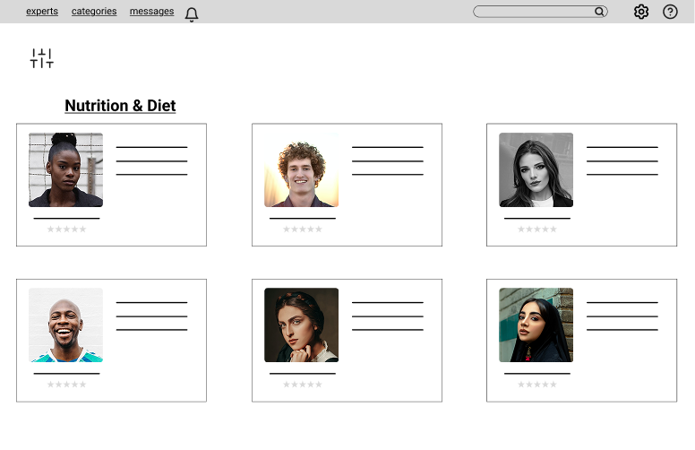
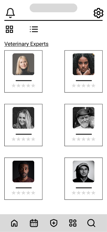
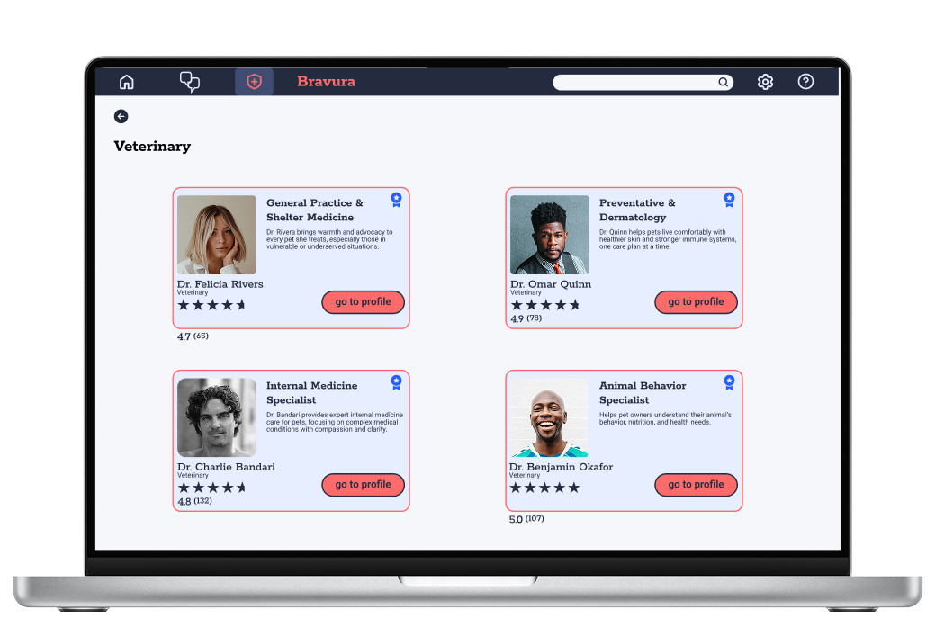
Expert Selection
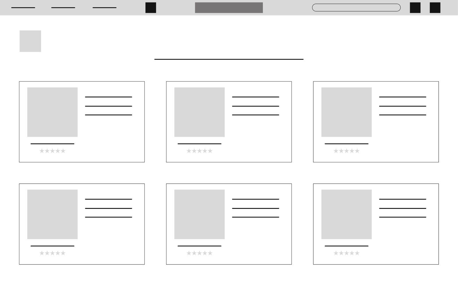
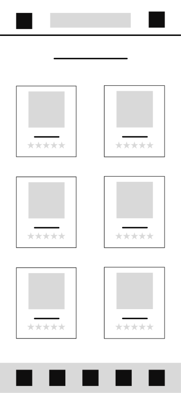
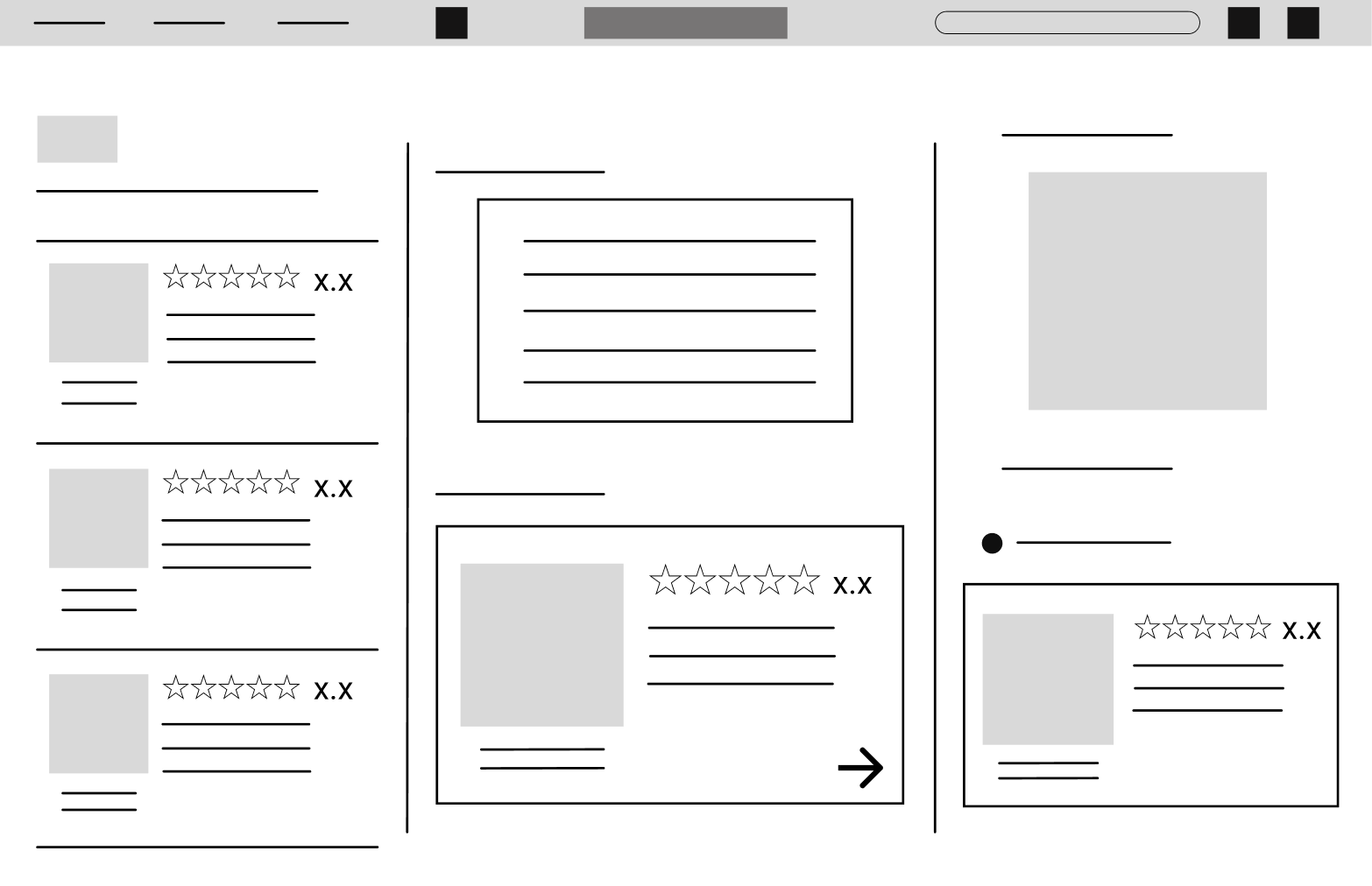
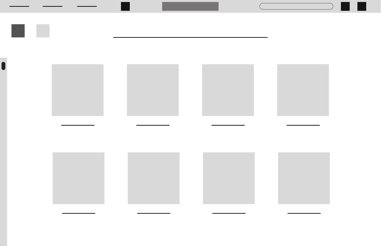
Mid-Fidelity Wireframes
Here, brand elements like Roboto and Rokkitt fonts were introduced, as well as component differentiation, and some initial iconography. Key interaction points (e.g., primary vs. secondary buttons) were visually defined, and realistic spacing and alignment were applied using a grid system. The design of the dashboard was simplified to reduce cognitive load.
Desktop
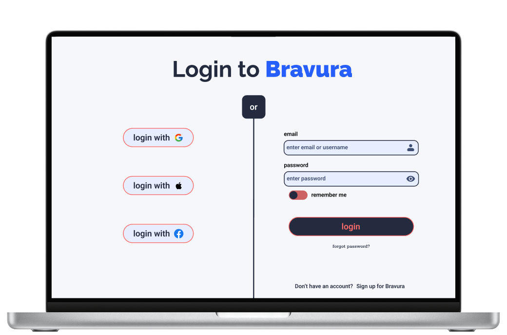
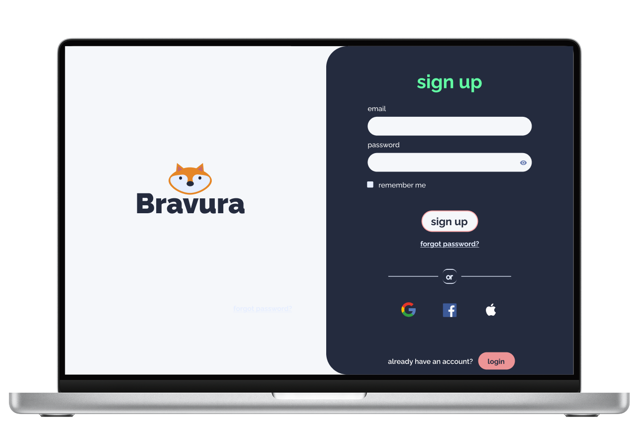
Login/Sign Up
Personal/Payment Info
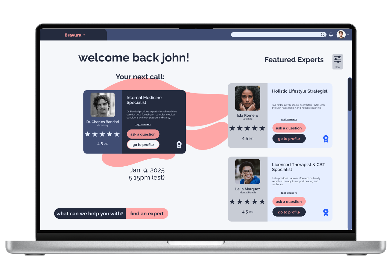
Dashboard
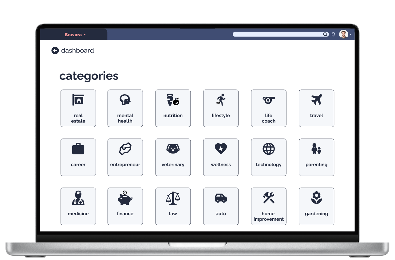
Categories
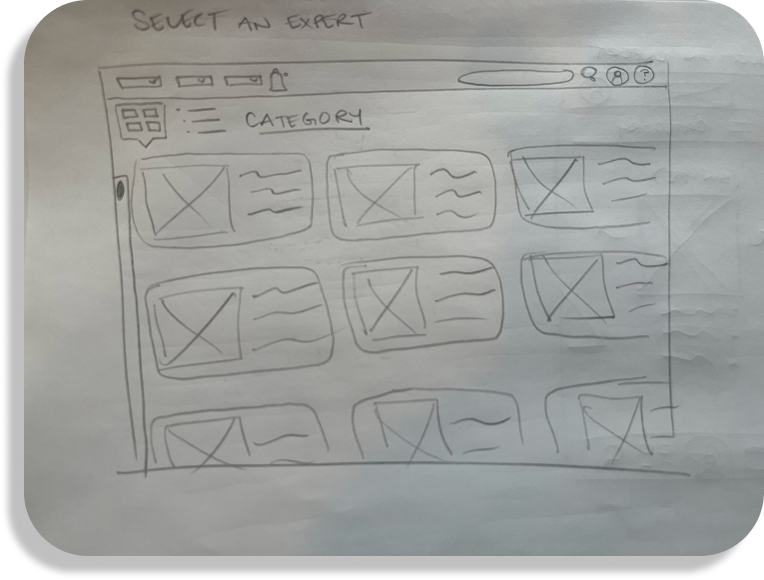
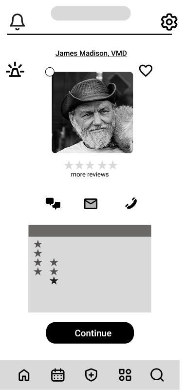
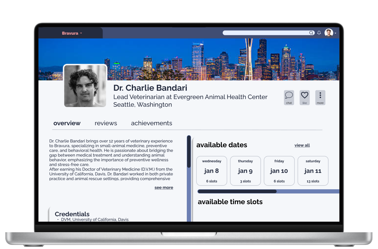
Select An Expert
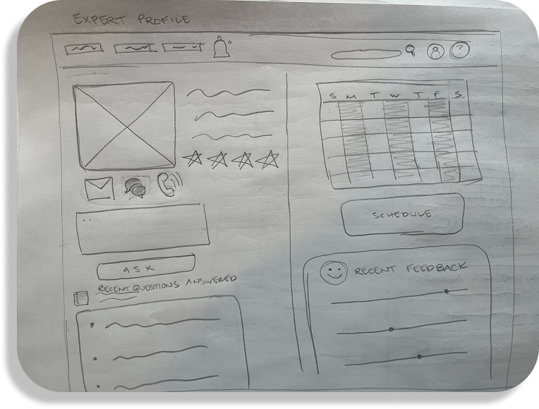
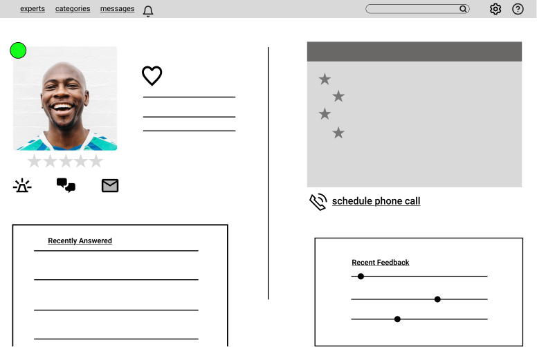
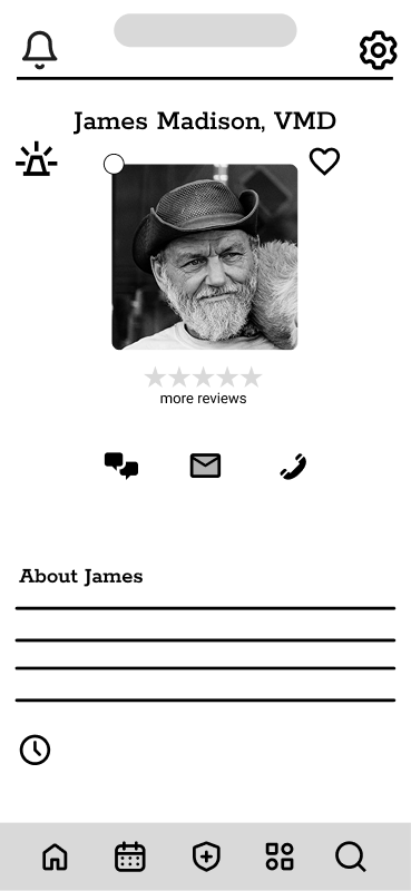
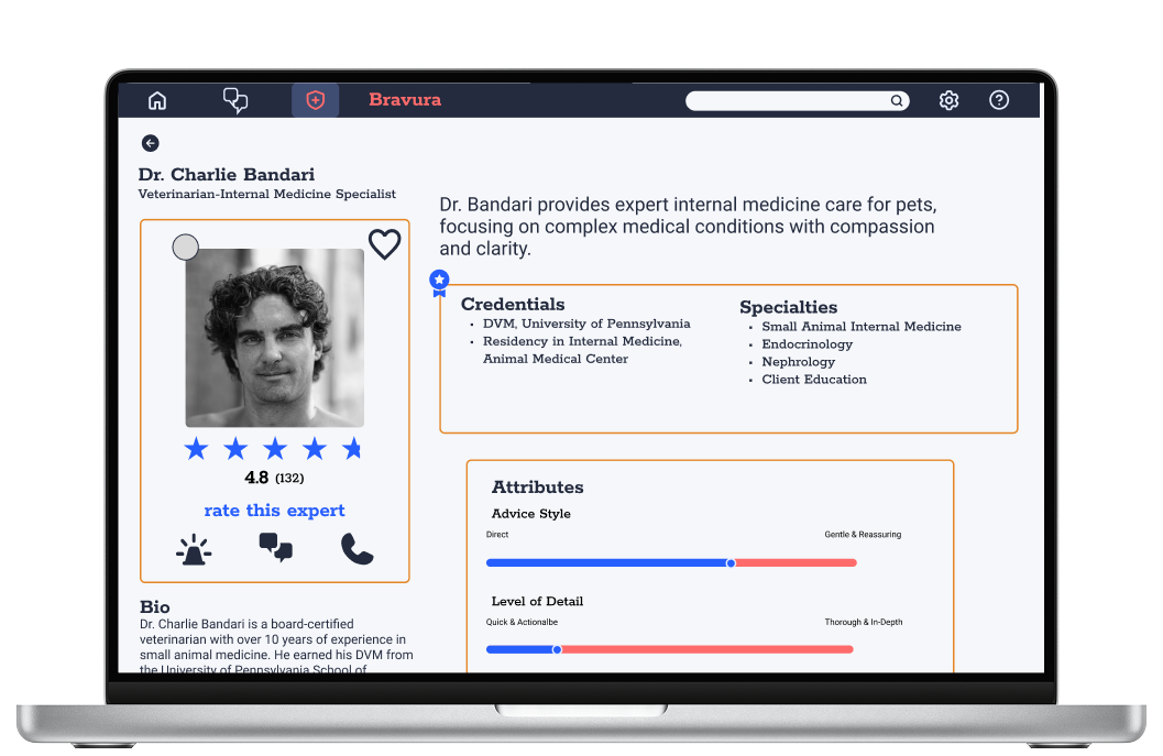
Expert Profile
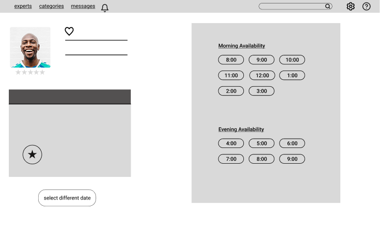
Scheduling
Mobile
Login/Sign Up
Personal Information
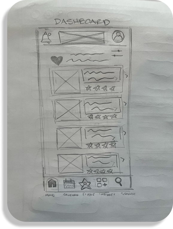
Dashboard
Categories
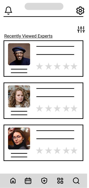
Select An Expert
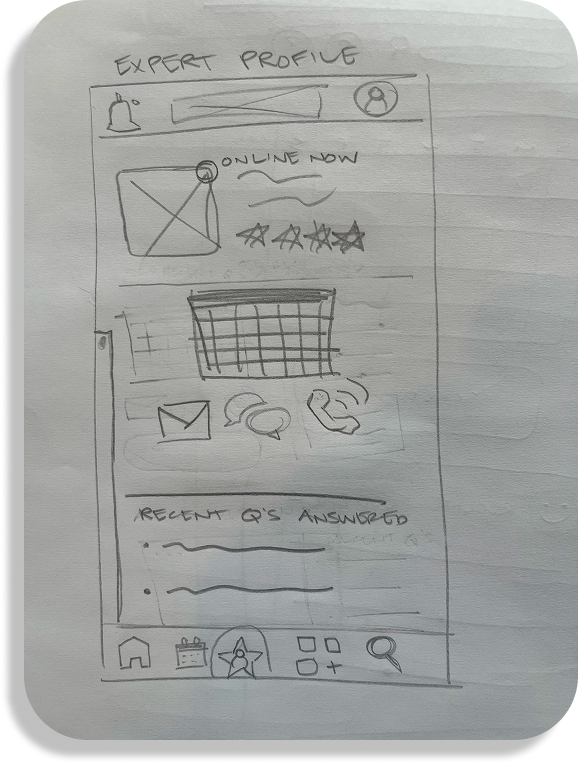
Expert Profile
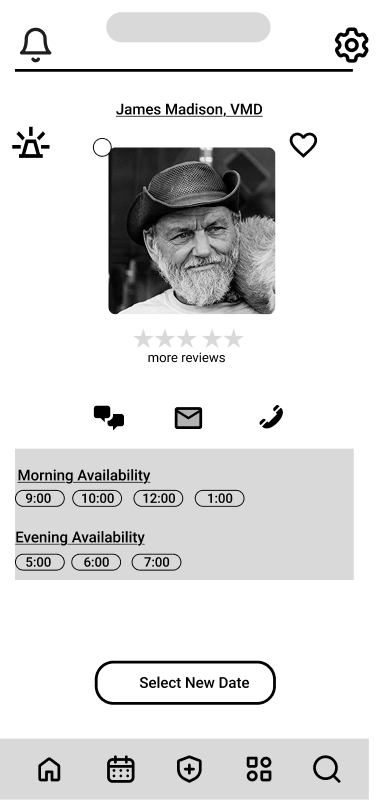
Scheduling 1
Scheduling 2
Design System
As the design progressed in fidelity, it was time to implement a system and brand identity to ensure a cohesive user experience across multiple platforms. I started by making decisions about simple things like color, font, and grid systems. Then about more complex things like icons and the tone that the app would embody. Then finally, interactive elements like buttons, input fields, and check boxes.
Brand Identity
App name: Bravura; noun
great technical skill and brilliance shown in a performance or activity"the recital ended with a blazing display of bravura"
Purpose: To empower users to seek advice from verified experts with confidence, clarity, and speed.
Tone of Voice: Trustworthy, empowering, friendly, confident, and clear
Actionable, empathetic, precise:
“Ask your expert now”
“Response in under 5 minutes”
“We’ve got your back”
Color

#275EFE

#242B3E

#E6EEFF

#F5F7FA

#FF6B6B

#E58626

#62FFA4

#404D73

#CD6262
Iconography
Buttons (Default & Hover States)


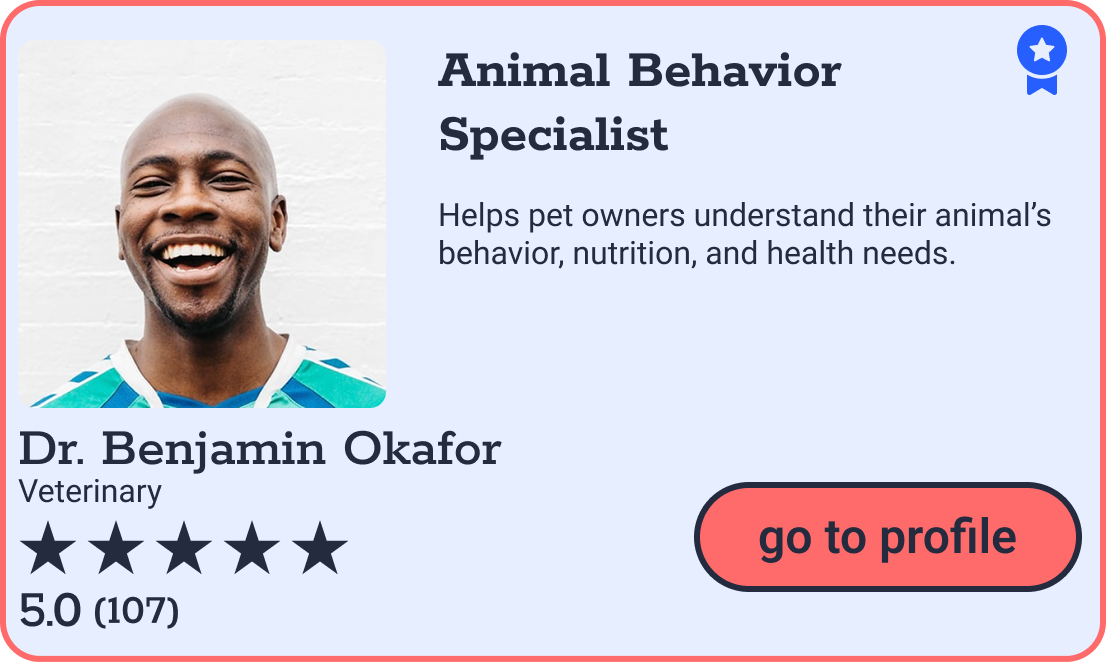
Expert Cards
Category Cards
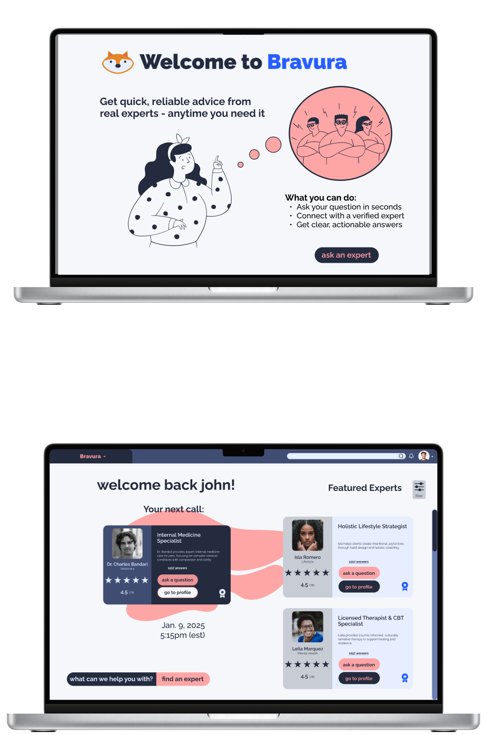
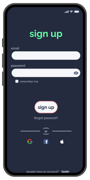
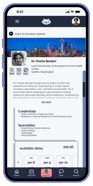
High-Fidelity Mockups
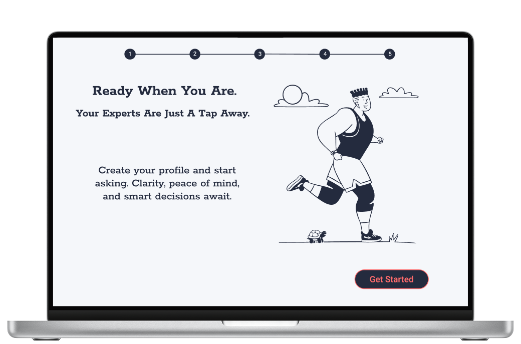
At this point, I was able to take the design system I had created and apply it to the wireframes to create a functional and polished prototype. This high-fidelity design attempted to recreate a complete user experience by starting with the sign up and onboarding process, to visiting the dashboard and category page to carrying the user through to scheduling an appointment with an expert.
Starting with hand sketched low-fi wireframes allowed me to focus on structure and concept. At this stage I was able to make cheap and fast changes through constructive criticism. As I moved into the high-fidelity versions of the product, I was able to focus more on specific details and accurate usability testing. By focusing on the structure first and then visual elements last, I enforced the design principle that form follows function, allowing the user’s needs to be met before applying the visual design.
REFINE
Usability Testing
Now that I had a fleshed out design and prototype, it was time to evaluate its ease of use by observing real users interact with the app. My goals for conducting usability testing were to uncover unforeseen pain points, measure the usability and performance of the product, and to improve user satisfaction. A product that is easy to learn and efficient to use leads to a positive user experience. This, in turn, boosts customer satisfaction, increases brand loyalty, and improves business metrics like conversion rates and user retention.
Goals
The primary goal was to assess how intuitively users could complete tasks in Bravura such as:
navigate the onboarding process and dashboard
browse categories and experts
communicate with an expert
set up payment within the app
Test Objectives
determine whether users can easily find and contact experts
identify usability barriers in the onboarding and question asking processes
identify errors and hesitations that occur during key task flows
evaluate overall satisfaction and trust in the platform
gather qualitative feedback to inform the next design iteration
Methodology
For this study, a combination of Moderated In-Person and Moderated Remote Testing were conducted. Audio, video, and the screen of a laptop were recorded for analysis. Each session included a brief introduction to the study, a guided series of usability tasks, and a short debrief to gather final impressions and feedback. Additionally, there was a chance for them to ask questions and add comments at the end of the remote sessions.
Participants
6 participants aged 25-45 were recruited from my personal network. Participants will be selected to reflect Bravura’s target audience: individuals seeking access to fast and credible expert advice online.
Insights
The usability test revealed key pain points in the prototype and informed focused improvements to enhance user experience. Six participants engaged with the app, and their feedback was systematically analyzed using a Rainbow Spreadsheet to identify the most significant issues. Based on severity, frequency, and ease of resolution, five priority areas were selected for refinement. The testing illuminated key insights that went previously unnoticed. Most importantly were those issues involving our users being able to trust the app. This is important as we want our users’ continued use of the app to maximize profits and popularity. The solutions to the issues mainly prioritize transparency, clarity, and usability. Starting by removing friction and confusion within these core features will improve functionality.
Emotional Design
Color and Personality
I put a lot of thought and research into the color scheme for the Bravura app and I hope it enhances the visceral experience. Because this is an app dedicated to give our users trustworthy and timely advice, it was important for me to keep the tone of the language and the psychology of the color consistent, supportive, and reassuring. For the main color, I’ve chosen to use varying shades of the color blue, one that is a medium tone and one that is on the darker side, almost black. The color blue evokes emotions such as trust, peace, loyalty, and competence, where black evokes such emotions as formality, sophistication, and security. The combination of these two sets of emotions form the foundation of the ethos I am aiming to evoke from the Bravura app. For the main accent, I’ve chosen a color I would describe as coral, it is a combination of orange and pink. It not only serves as a great complement to the blues, it evokes emotions like: confidence, success, compassion, and sincerity, further expanding on the ideas from the above paragraph. This color scheme mixed with a slick, intuitive, and friendly design will not only appeal to users on the visceral level, but also on the behavioral level.
Rewarding Interactions
I think there is a lot of opportunity for Bravura to offer our users rewards for interacting with the app. I’m still in the brainstorming phase of this portion, but early ideas include offering users the opportunity for free credits or discounted advice once they have used the app X amount of times, or have asked 10 experts for advice. The metrics for the reward can be decided later for what makes sense for stakeholders. Another idea I had, was to offer some more whimsical rewards, or “Easter Eggs” with continued and consistent use of the app. This could include options for fun avatars for users’ profile pics or stickers they can use within the messaging portion of the app. My final idea in this arena is to create a mascot for the app, but again, am only in the brainstorming phase of this. It seems that an owl would be the perfect choice for this role, however I am skeptical due to the fact that Duolingo has an owl for their mascot. Other options I’ve thought of are a fox and a tortoise, however the cons of these two choices are that foxes can be perceived as deceptive and tortoises as slow, both traits I do not wish for our users to associate with the app.
Delightful Animations
I think that Bravura presents ample opportunity for animation. The introduction screen could be animated with the red sphere of experts sliding into view. The onboarding screens have been somewhat animated in the way that each screen slides in from the right. Any spot in the user flow where there is a carousel of screens is an opportunity for a simple animation to be placed. Other opportunities would be to animate the way in which messages populate the messages screen, or a way to delete or save messages. There is also an opportunity to animate the list of expert messages as new ones come in. The green circles in the upper left corner of the expert’s profile pics indicating that they are online could surge in and out, and a playful animation could be added to the giant green check mark on the confirmation/congratulations screen. I am also in the process of designing a logo for the app which could have an animation added to it on both desktop and mobile versions wherever it appears. I am not quite sure how to accomplish all of these animations, but will watch tutorials and research ways to make them happen.
Peer Review
I’ve gone through and implemented most of the suggestions I was given by my peer review session. It did take about two weeks for me to get three peers to review the work I had done. In the waiting period I reached out to my mentor and a friend that works in UX, so the suggestions I was given were numerous. I decided not to correct the Expert Vetting Explanation Screen quite yet as I want to think about the redesign and make efficient changes.
ITERATE
BRAVURA DESIGN 2.0
After digesting the input I received from the peer review, I was able to update and improve the UX and UI of the app. Some of the color choices have been changed due to accessibility issues as well as some of the layout of the screens and elements such as buttons and input fields. Next steps will be to incorporate elements such as gamifying some of the interactions and including some animation.
The End
Thank you to all of the participants, and to my Career Foundry mentor and tutor!