isenart.com
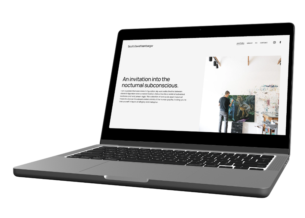
Creating a transparent UI portfolio experience for Contemporary Fine Art.
Role: Solo UX/UI Designer, UX Writer, & Web Developer
Timeline: June-July 2026
Tools: Figma, Squarespace, Photoshop
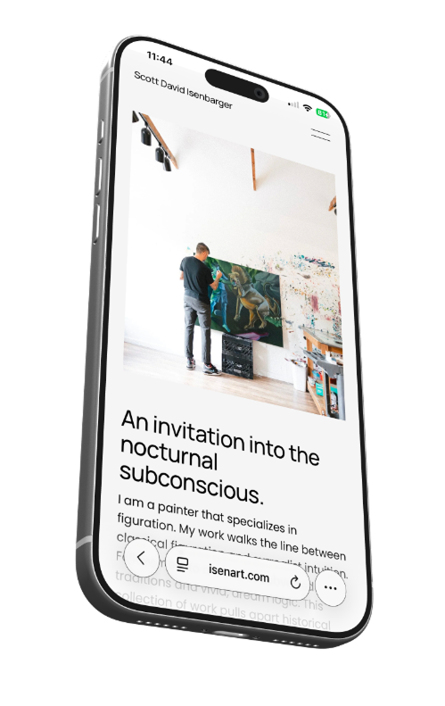
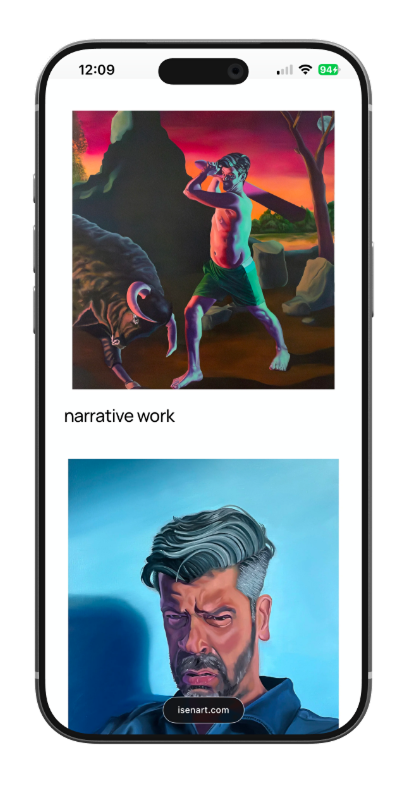
The Challenge: To build a web experience that feels like stepping into a clean, modern physical gallery. To offer breathing room for heavy and solemn narratives while optimizing for gallery directors, collectors, and press.
The Core Challenges:
Fine art websites often fall into two traps: they are either over designed, with distracting UI elements that clash with the artwork, or under designed, resulting in dense, confusing lists that fail to establish the artist's professional credibility.
The Goal:
To design and build a responsive web experience that acts as a quiet, physical gallery wall. To utilize a minimalist typographic scale and generous white space to let highly saturated, surreal narrative paintings take center stage.
Visual Language and the Principle of Contrast
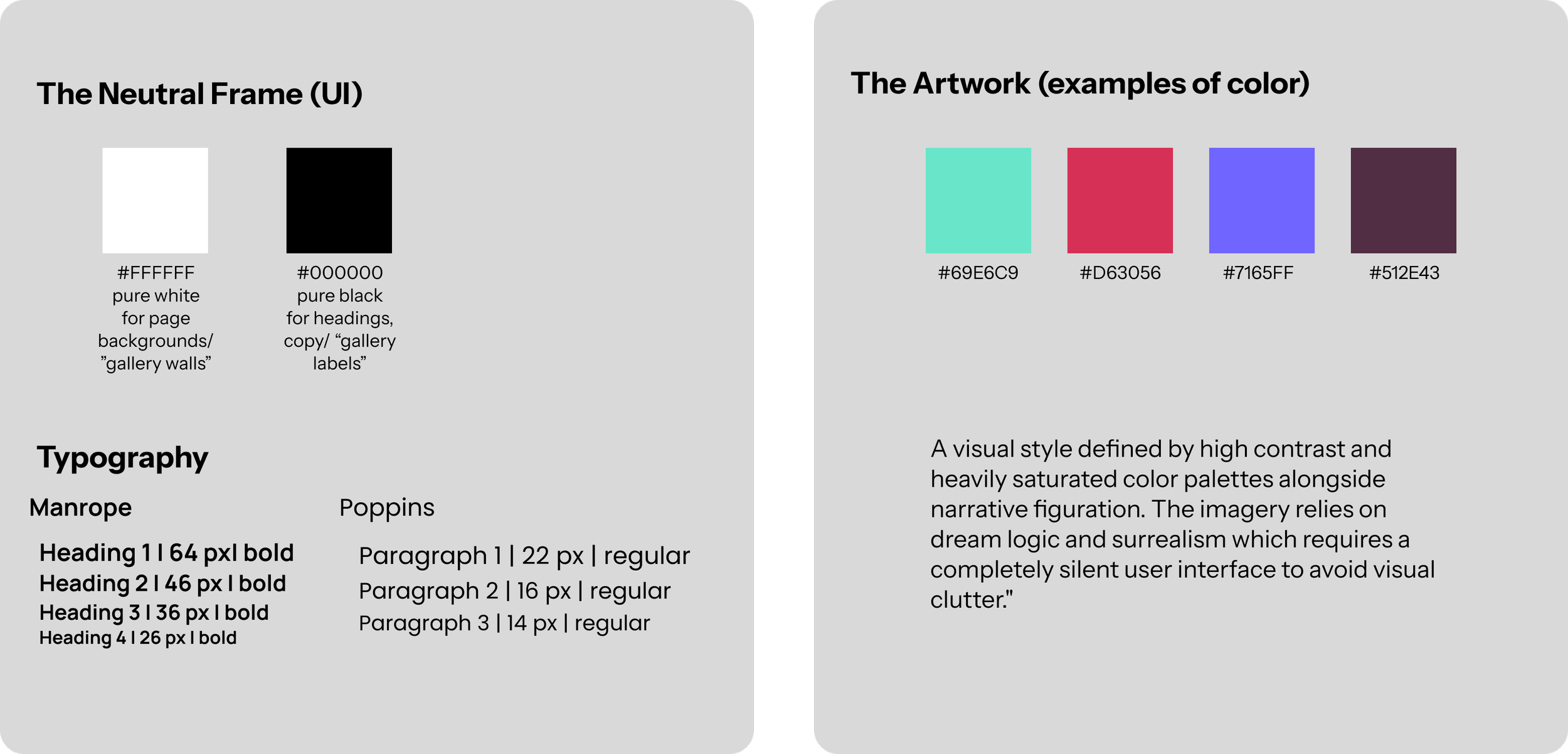
Because I was designing a digital space for vibrant, complex paintings, the user interface had to act as a background element. If the UI utilized expressive typography, decorative borders, or an active color palette, it would create visual noise.
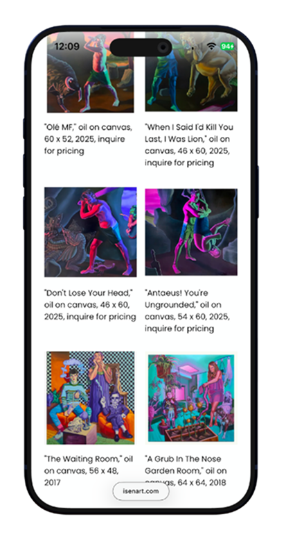
My design system relies on a stark contrast of sterile, highly structured UI elements acting as a quiet frame for vibrant, chaotic, and saturated canvases.
Information Architecture
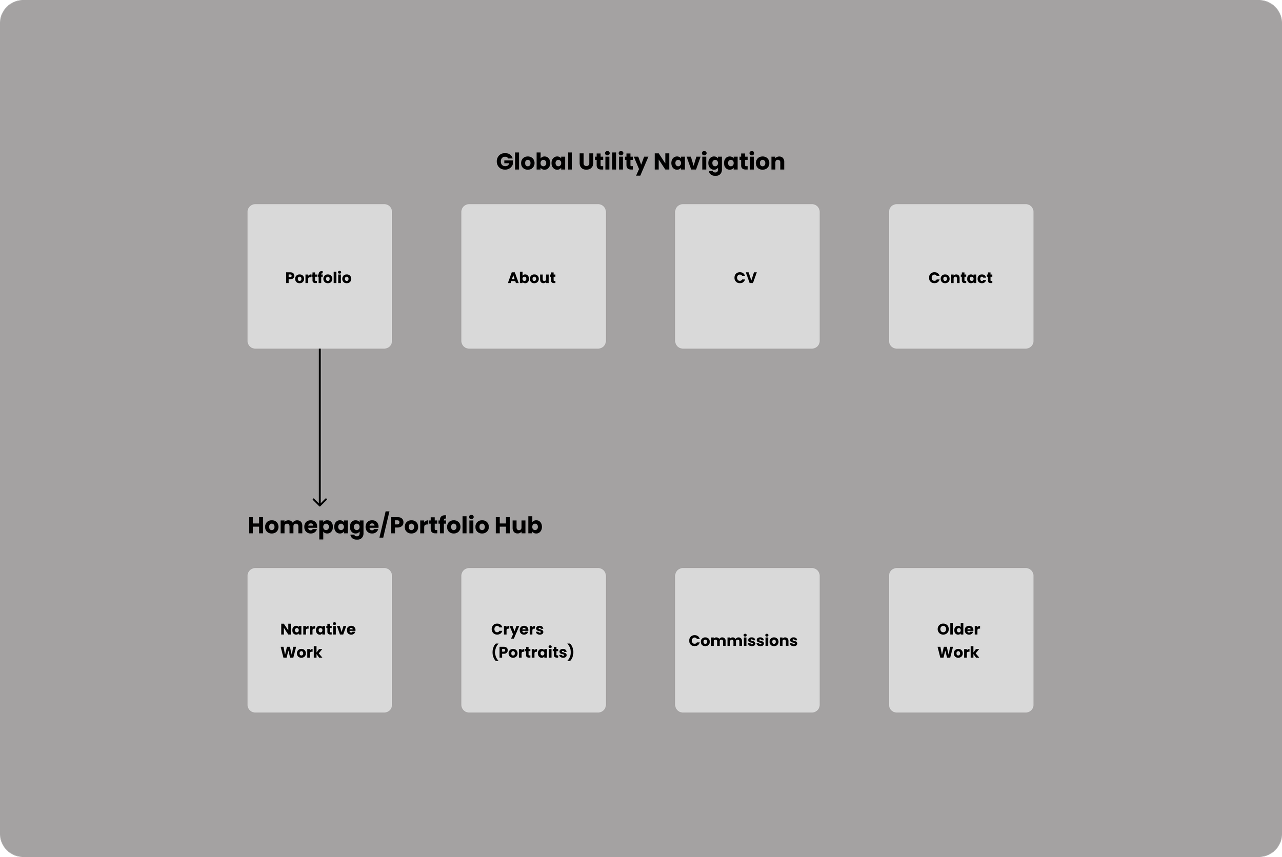
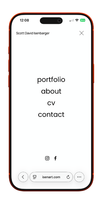
This hybrid navigation structure balances exploration with administrative efficiency. Thumbnails on the homepage funnel art enthusiasts directly into distinct creative categories, while the fixed top bar provides an instant path for curators and collectors seeking professional credentials or immediate contact.
UX Rationale
Responsive Layout System
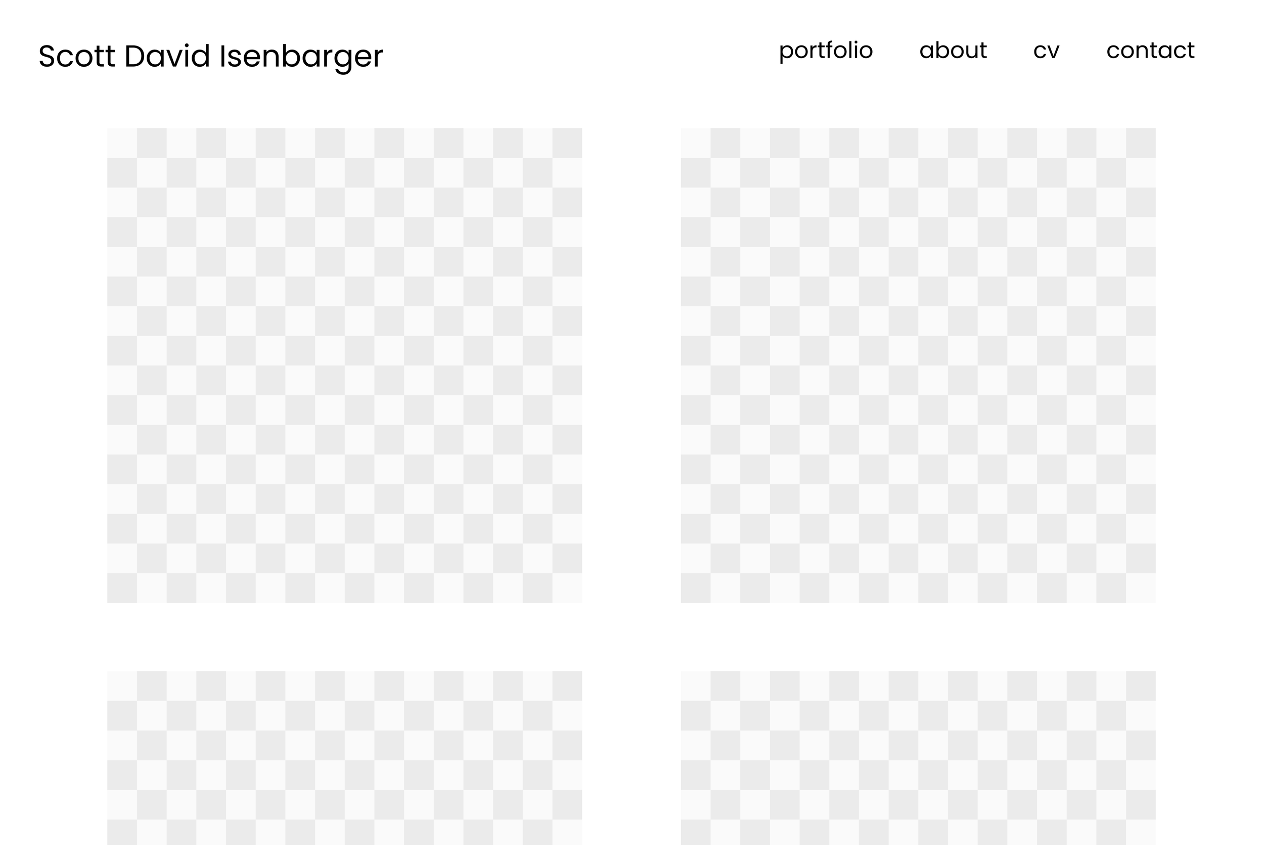
Desktop View
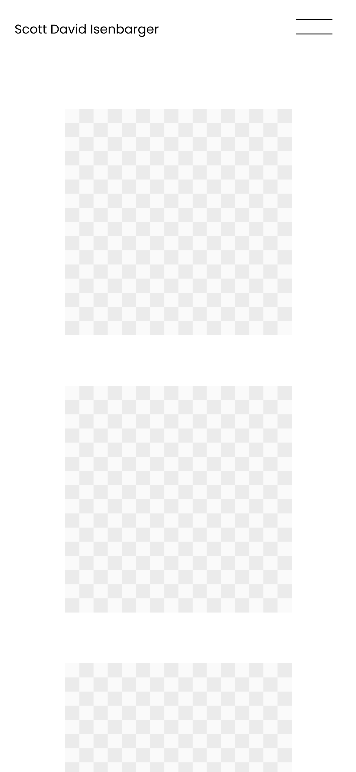
Mobile View
UX Rationale
Designing with a mobile first mindset ensures that the core visual content remains the focal point across all screen sizes. The desktop view utilizes a multi column grid with large thumbnails to maximize screen real estate and preserve detail, while the mobile layout stacks content vertically to maintain high readability and effortless scrolling.
Project Outcomes and Reflection
Design Solutions
Zero Friction Interface
The silent white frame allows the intense color saturation of the paintings take center stage on the page
Physical to Digital
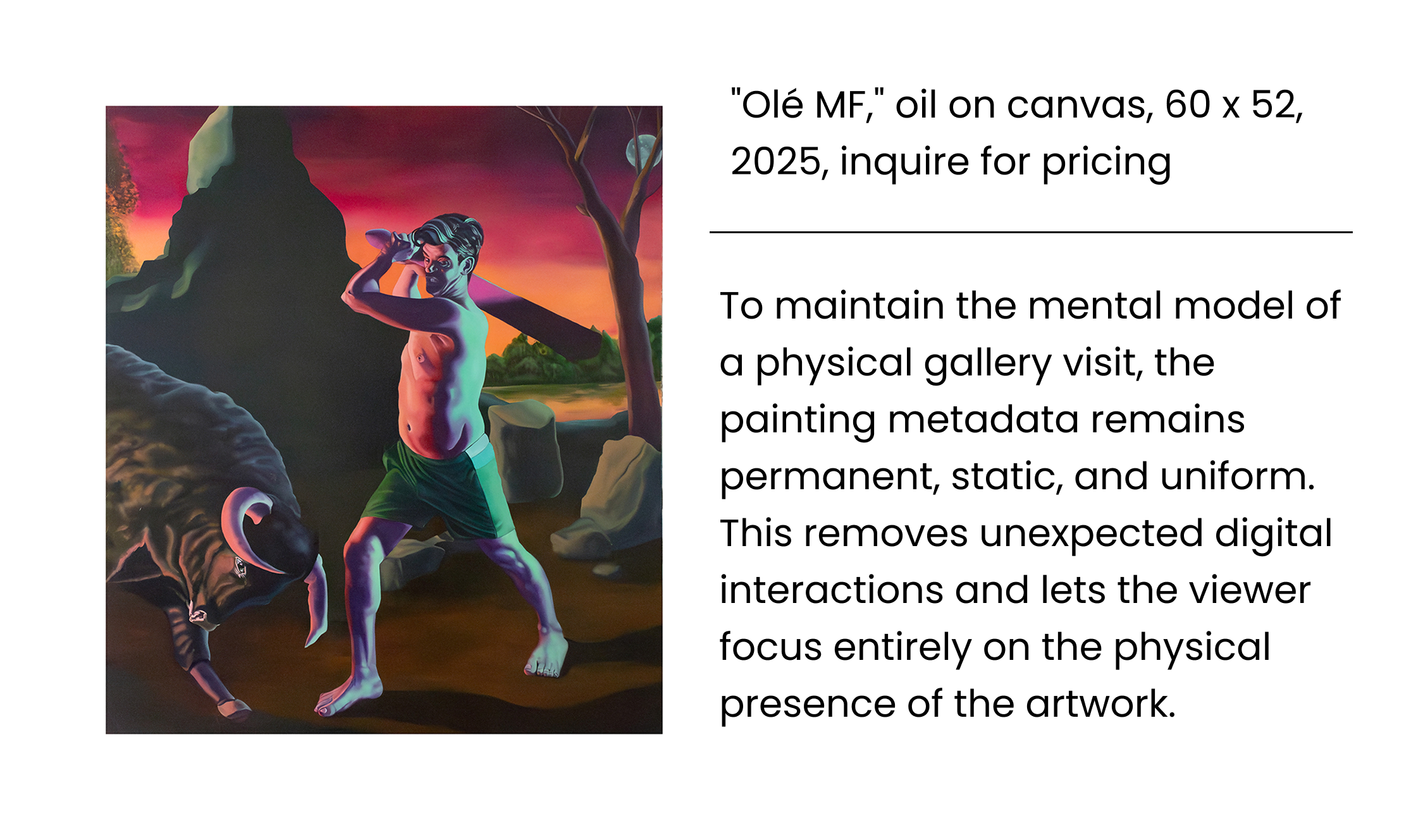
Permanent metadata labels mirror the traditional gallery experience for curators and collectors
Key Takeaways
Content First Design
Structuring the layout to serve the artwork rather than forcing it into a box
Balancing Two Worlds
Bridging a physical studio practice with a functional and accessible digital space
The Case Study Summary
The final design successfully translates a physical studio practice into a modern web experience. By applying a clean visual system and a simple information architecture, the site achieves a gallery level presentation that removes administration friction from buyers, collectors, and curators.