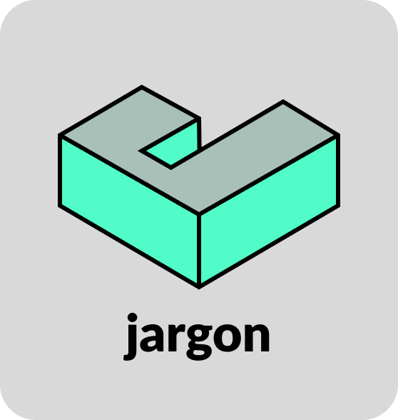
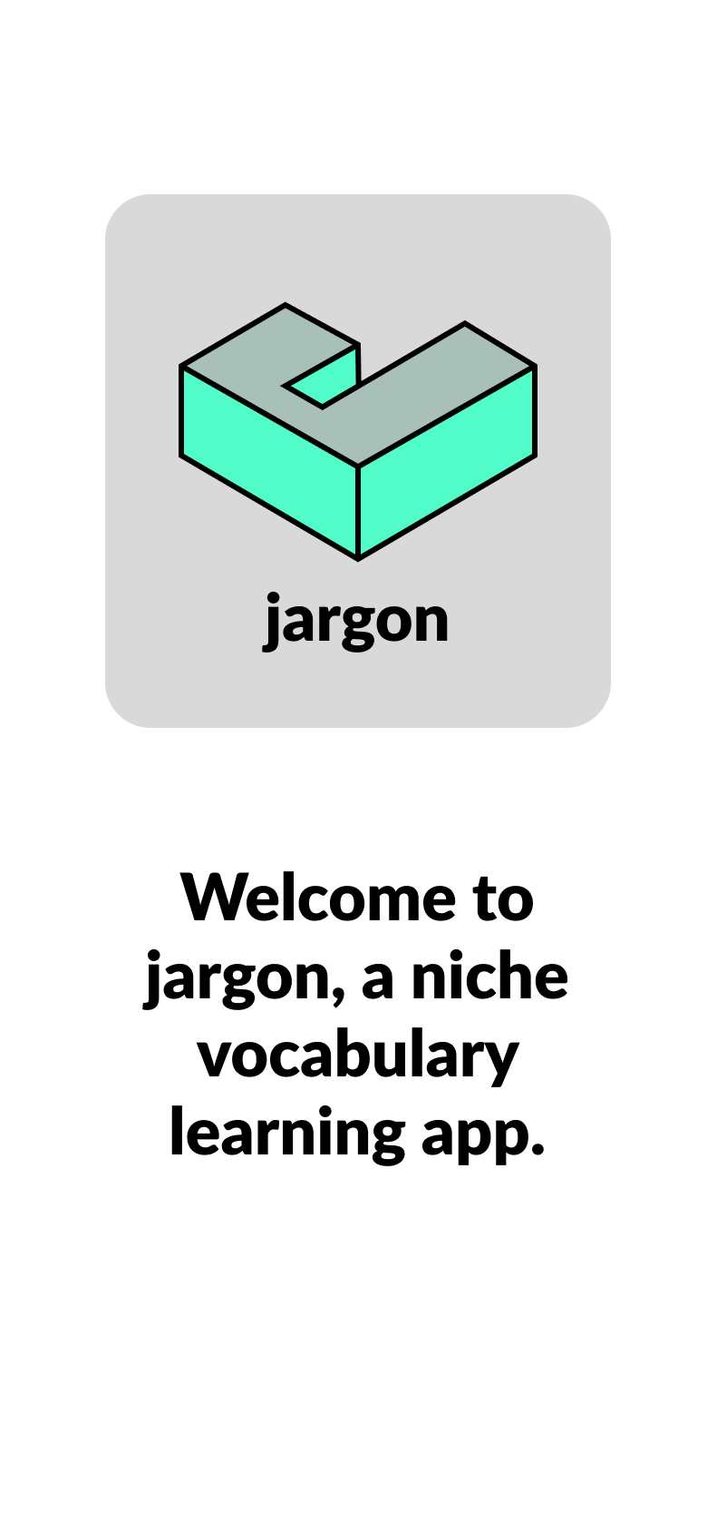
Jargon
A flash card app for memorization
UX/UI Case Study
Project Overview
Jargon is a targeted mobile interface design focusing on micro-learning workflows and short-form content delivery. Developed as a rapid prototyping exercise, the project isolates the core user journey of mastering dense technical and visual terminology—such as art history concepts like Chiaroscuro—by mapping key interactive states, navigation systems, and high-fidelity typography across a focused, essential screen flow.
The Problem
How might we design a mobile app that empowers people to learn new vocabulary?
Project Meta Data
Role: Lead UI/UX Designer (Concept)
Timeline: November-December 2025
Context: Focused Interface & Rapid Prototyping Sprint
Core Focus: Mobile UI Design, Micro-Interactions, High-Fidelity Prototyping, Visual Hierarchy
Step One: Competitor Research
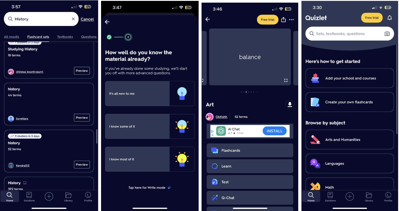
My first task was to research existing vocabulary apps to give me a better idea of what was already available or where there were opportunities for growth. I chose Anki, Memrise, and Quizlet to focus on. I wanted to identify their positives and negatives to help guide me once I started designing my own app, which was later named Jargon.
Anki
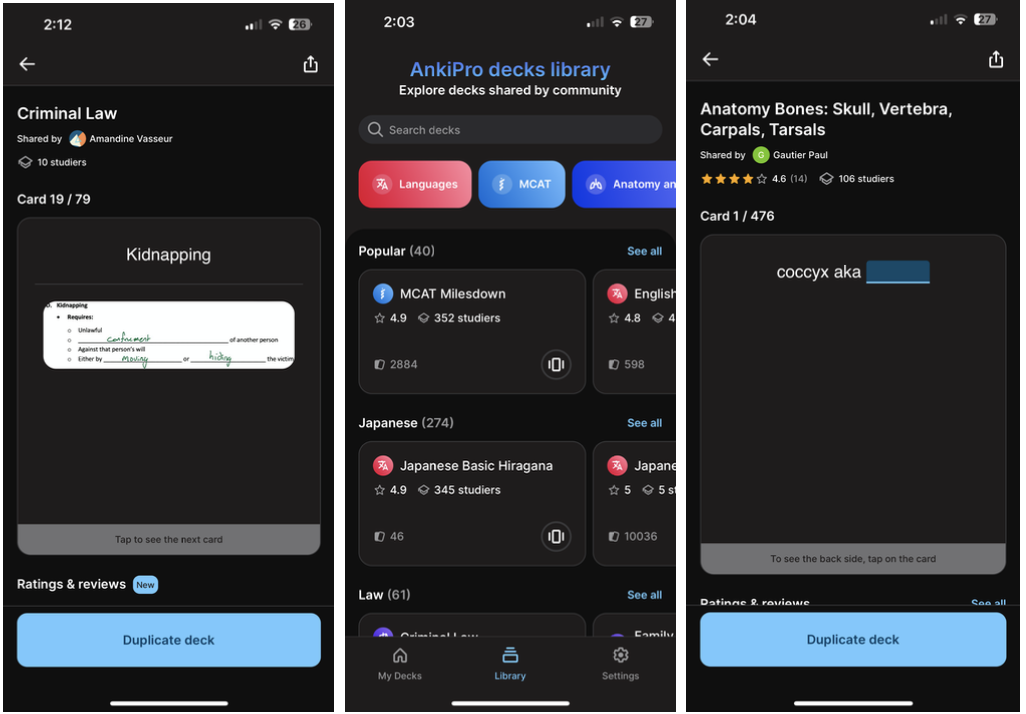
Memrise
Quizlet
Summary
This research reveals a clear spectrum of utility, ranging from specialized tools to versatile, user friendly platforms. While Anki offers high personalization for professional fields like law and medicine, it suffers from a disjointed UI and a high friction rating system that disrupts the learning flow. Memrise succeeds through its focus on language immersion and native speaker media, yet it is hindered by inconsistent production quality and repetitive content. Ultimately, Quizlet emerges as the most balanced solution by bridging the gap between customization and accessibility. It maintains the flexibility of user generated decks while implementing standardized templates and intuitive gesture controls, such as swiping, that sustain a superior "flow state." While each app serves a distinct niche, the research suggests that the most successful educational tools are those that minimize cognitive load through consistent design and intuitive navigation without sacrificing the user's ability to curate specific content.
Step Two: User Research
My next step was to reach out to 3-5 people and ask them about their experiences and wants when it came to learning new vocabulary words, either for work, school, or fun. I created a concise script and a list of questions to ask each participant, and then used a worksheet to break their responses down into three categories: DOING, THINKING, and FEELING. Doing this helped to gain an empathetic and holistic understanding of the user. This method of qualitative research gave me insight into the “what” and the “why” behind their answers.
DOING
“I usually bail on apps that are too slow or don’t help me see progress”
“Showing me stats/giving me something to work towards is a good motivator.”
“I would be motivated by an app that was effective. I would be unmotivated by an app that was slow, buggy, laggy, or that appeared to be focused more on making money for the developer than an actual learning tool.”
THINKING
“I think points are sometimes a good reminder of progress.”
“I think a variety of learning methods is good, not only because people learn differently but because it also helps keep it interesting to move between different types of exercises.”
“I don't use apps to study, but if I did I would prefer one that combines different ways of learning because I think different methods of reinforcement would increase retention.”
FEELING
“I need to learn things constantly but it can sometimes feel like i’m “wasting time” and my attention gets pulled into more direct client work”
“I need continued and immediate dopamine rewards.”
“Free and not ad-based. Simple visual design and uncluttered. Intelligent logic to help identify strengths and weaknesses in learning and help improve weaknesses.”
Research identified many common needs and wants with a vocabulary learning app, as well as pain points involved with using an app to learn in general. For example, all of the participants identified that some sort of gamification would be great motivation for learning, as well as retention. Additionally, all of the participants would get frustrated by several factors such as: an app that was an obvious cash-grab for developers, if there were too many ads, or if the user experience was lagging or full of crashes and bugs.
Step Three: Primary User Persona
Using the information I had gathered from my user research, my next step was to distill those answers into a single ideal user. I created behaviors, user stories, as well as needs and goals for this primary user. Additionally, I refined the original problem statement provided by CareerFoundry and finalized an initial hypothesis to solve the problem.
Alex Taylor

39 years old
single
BA in communication
lives in Brooklyn
works as a marketing specialist
must learn vocabulary on a regular basis for work
“I need an app that makes learning new words fun and easy, even on a busy schedule.”
“Tracking my progress keeps me motivated and lets me know how much I’ve improved.”
“I want to create my own flashcards and have the app adapt to my learning pace.”
Behaviors
Spends around 30 minutes per day on vocabulary learning. This generally happens on a lunch break, or during a subway commute due to a busy work/life schedule.
Uses multiple devices, smart phone during the day and a tablet at night.
Prefers short, engaging learning sessions.
Frequently shares progress and achievements on social media.
Enjoys the flashcard feature because she can customize decks and take notes.
Needs & Goals
An easy-to-use app with an intuitive interface.
A variety of interactive and/or gamified learning methods to prevent boredom and increase motivation.
Progress tracking and performance analytics.
Personalized learning experience with customizable vocabulary sets.
Expand vocabulary to enhance professional communication and career development.
Improve overall language skills for better comprehension and expression
User Stories
As Alex, I want to create custom vocabulary flashcards, so that I have an option to focus on the words most relevant to my career.
As Alex, I would like to be able to use the app offline, as I do most of my studying on the train during my commute to and from work.
As Alex, I want to see detailed progress reports and analytics so that I can understand my learning patterns and areas for improvement.
As Alex, I would like there to be an element of gaming to keep me engaged and motivated to use the app.
As Alex, I would like there to be a note taking feature on the app so that I can review them when I am having trouble remembering or if I forget something.
Problem Statement
Alex needs a convenient and engaging way to learn and retain new vocabulary because traditional methods are time consuming and do not fit well within her fast-paced lifestyle.
We will know this to be true when Alex is motivated to use the app consistently, is learning and retaining new vocabulary, and is regularly adding new flashcards and notes as necessary for her work life.
Hypothesis
We believe by creating an intuitive, interactive vocabulary learning app with customizable flashcards, progress tracking, a point system, and offline capabilities, we will help busy professionals like Alex efficiently expand their vocabulary, leading to improved communication skills and career advancement opportunities.
Step Four: Information Architecture
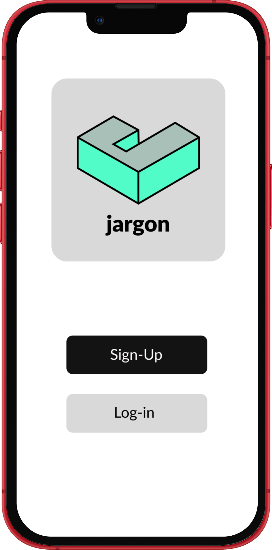
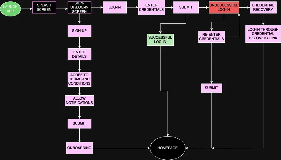
Using the Primary User Persona, my next task was to start building the information architecture. At this point, I identified a few main tasks that ‘Alex’ would need to complete while interacting with Jargon. I chose to illustrate the login/sign-up process and how to add a flashcard. I started by thinking about the entry point, then identified a goal and success criteria for each task. Utilizing user flows and task analyses, I began to visualize how ‘Alex’ would move through the app.
Task 1: Login/Sign-up Process
Entry point: user opens the app
Goal: The user creates a new account for a personalized learning experience or the user logs-in to an existing account to continue learning
Success Criteria: User successfully creates a new account for onboarding or user logs-in successfully to continue studying
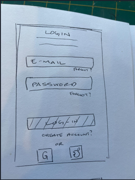
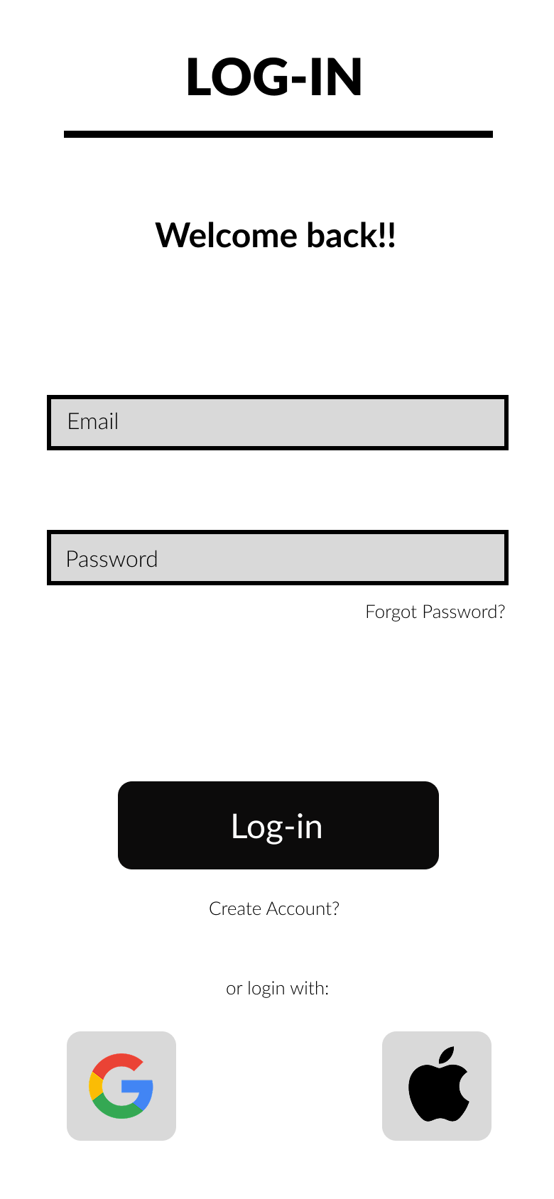
Task 1 Analysis: Login
Open the app
Select “Login”
Enter username and password
If incorrect (forgot username/password?)
Username/password recovery (if necessary)
Retype username and password
Submit
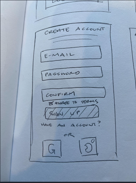
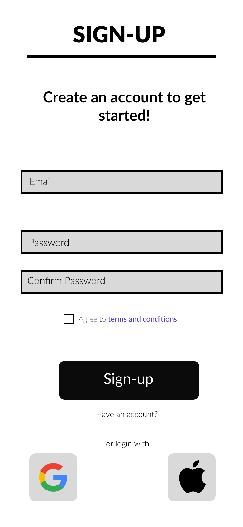
Task 1 Analysis: Sign-Up
Open the app
Select “Sign-Up”
Enter personal information
Agree to terms and conditions
Allow notifications
Submit
Complete Onboarding
User Flow: Task 1
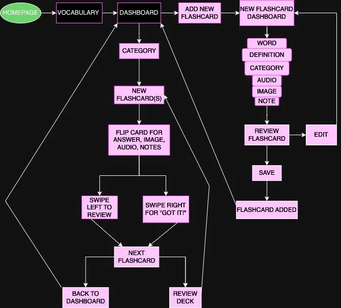
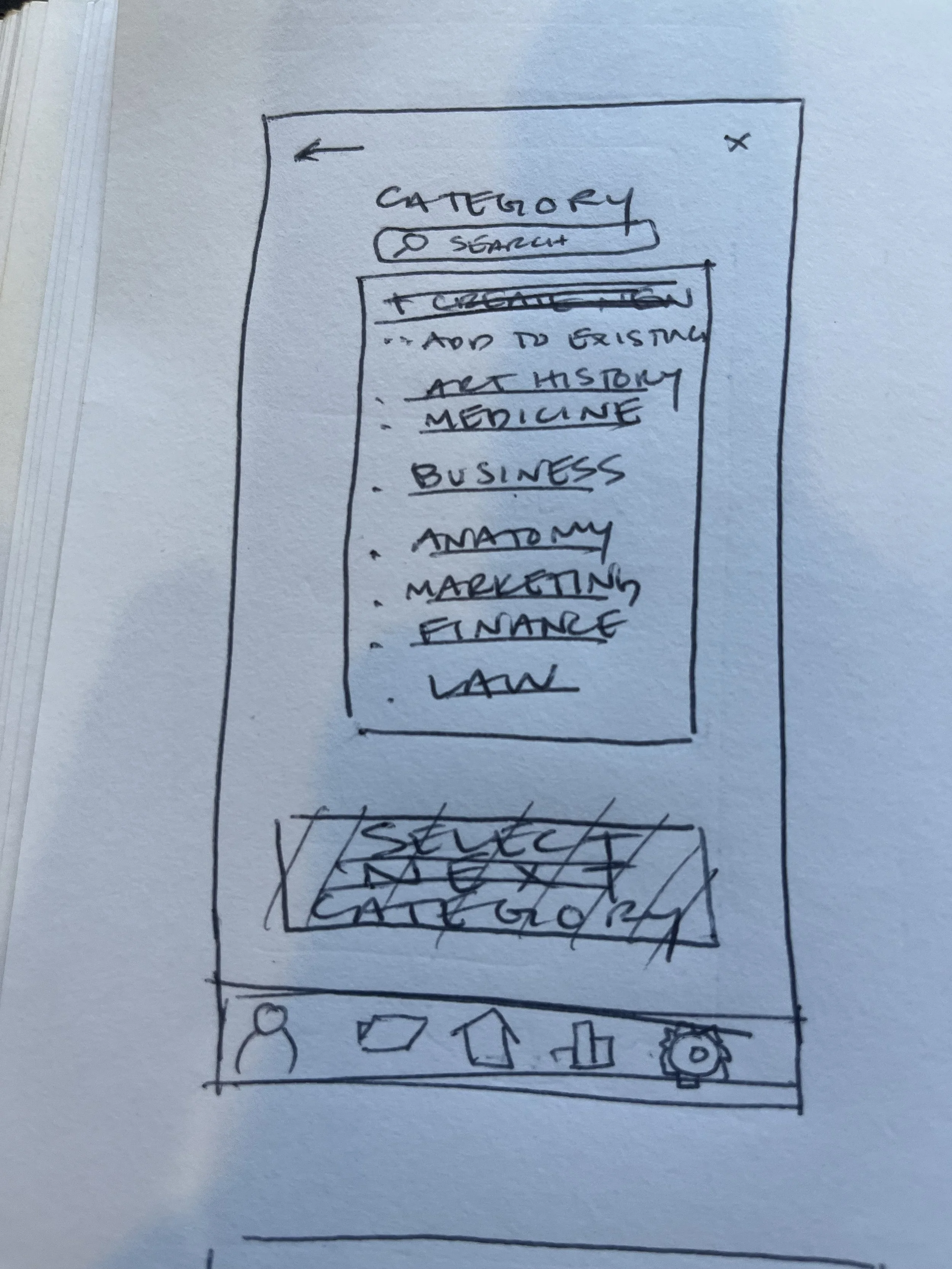
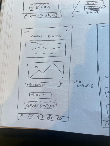
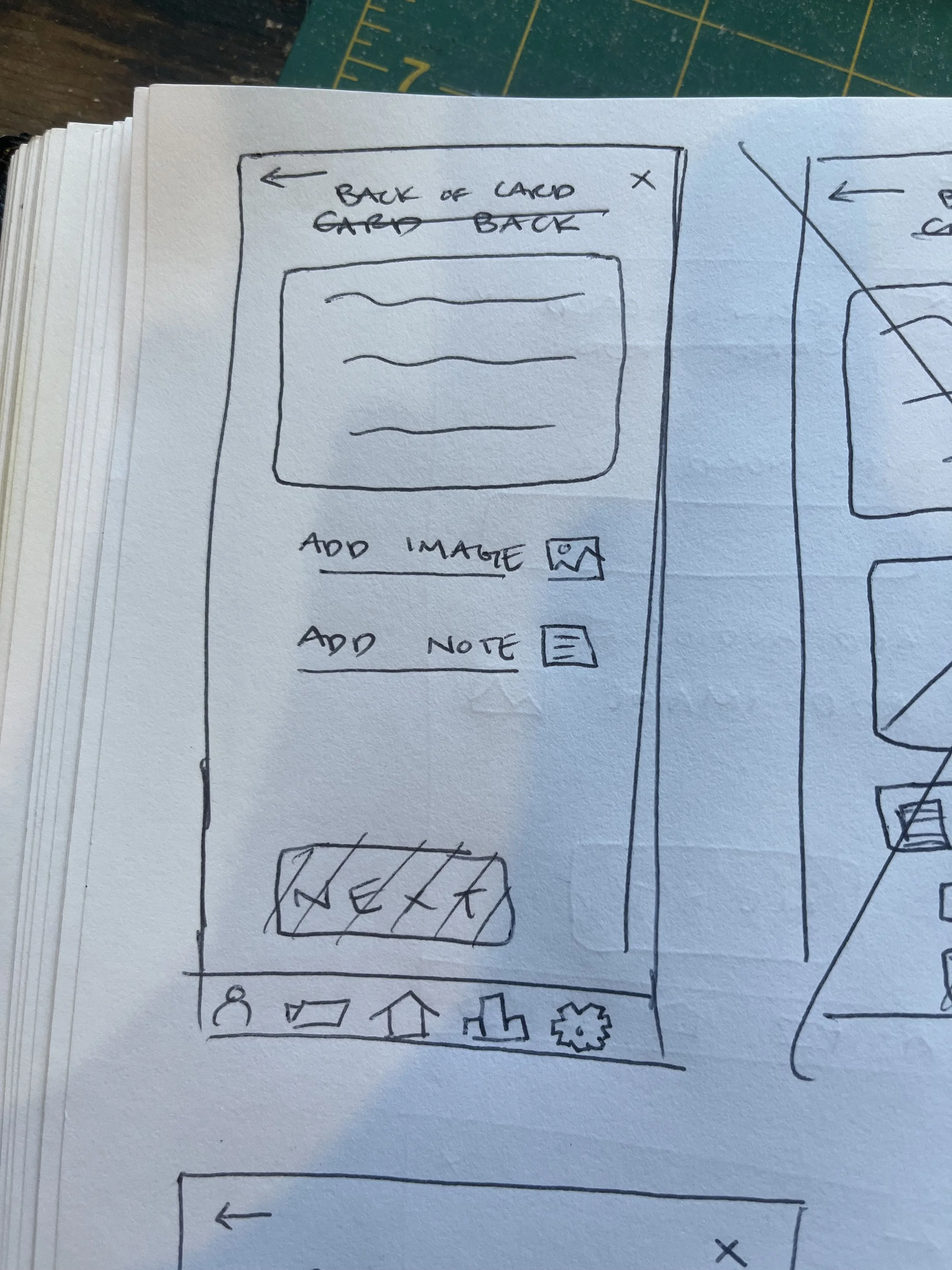
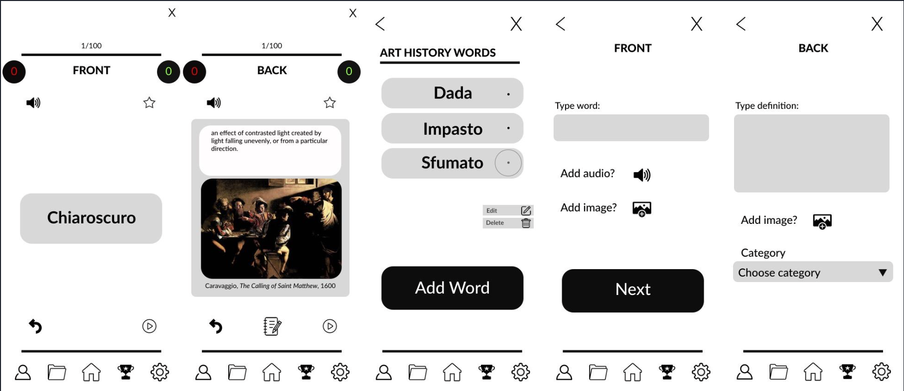
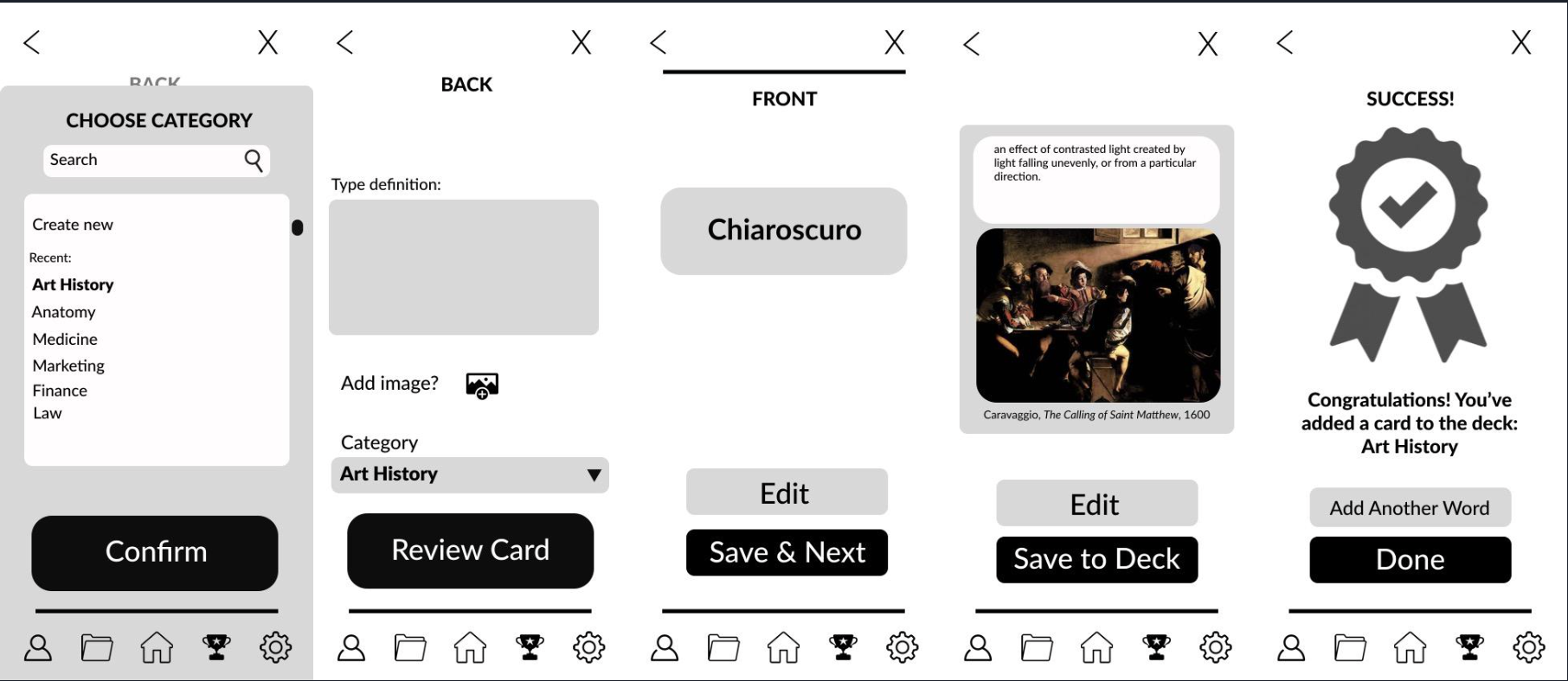
Task 2: Creating a New Flashcard
Entry point: Homepage
Goal: An easy way for the user to upload new vocabulary that allows for a personalized definition, audio recording for pronunciation, upload an image reference, and a space for note taking
Success Criteria: User successfully creates new flashcard(s) for immediate study
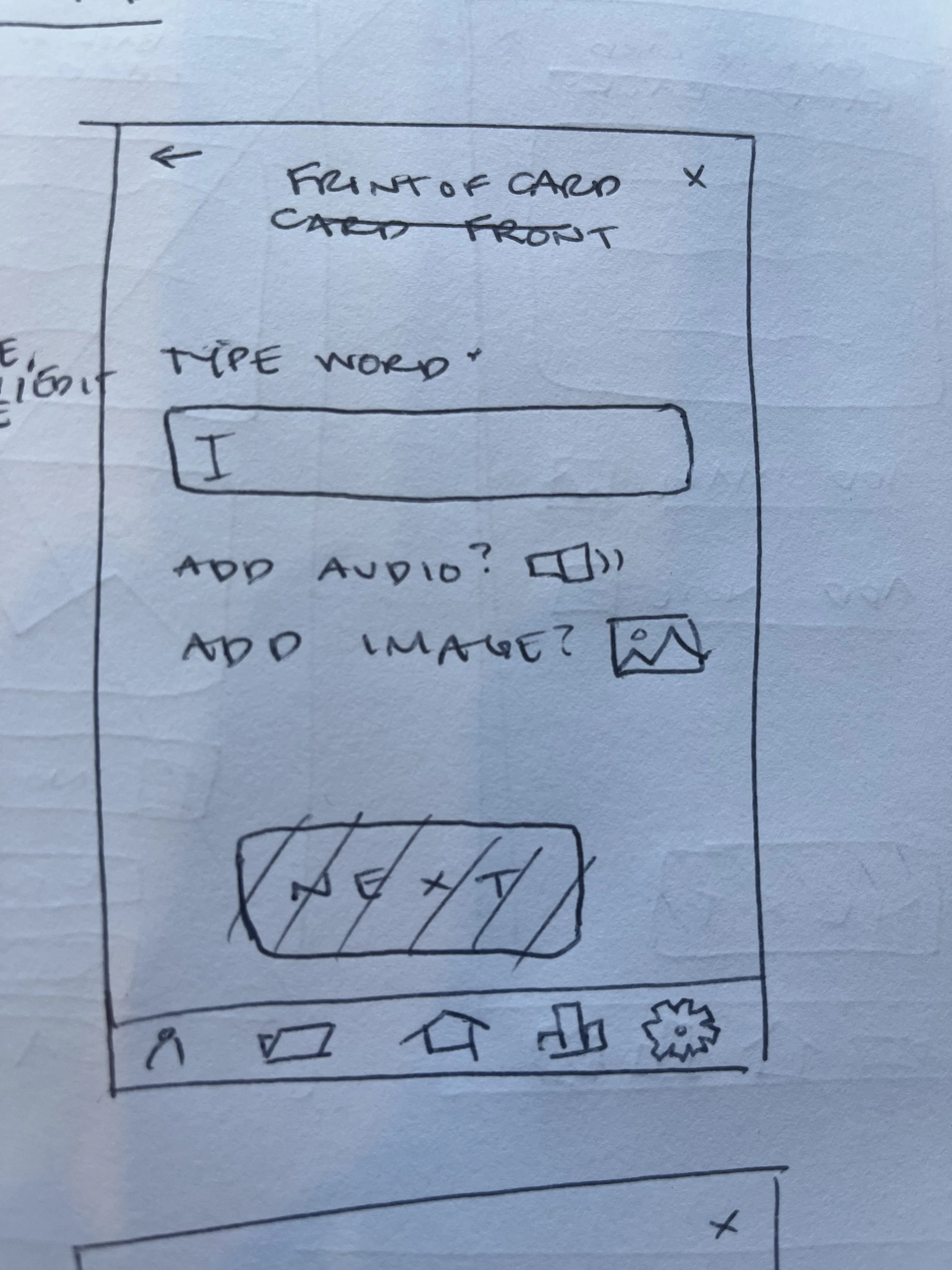
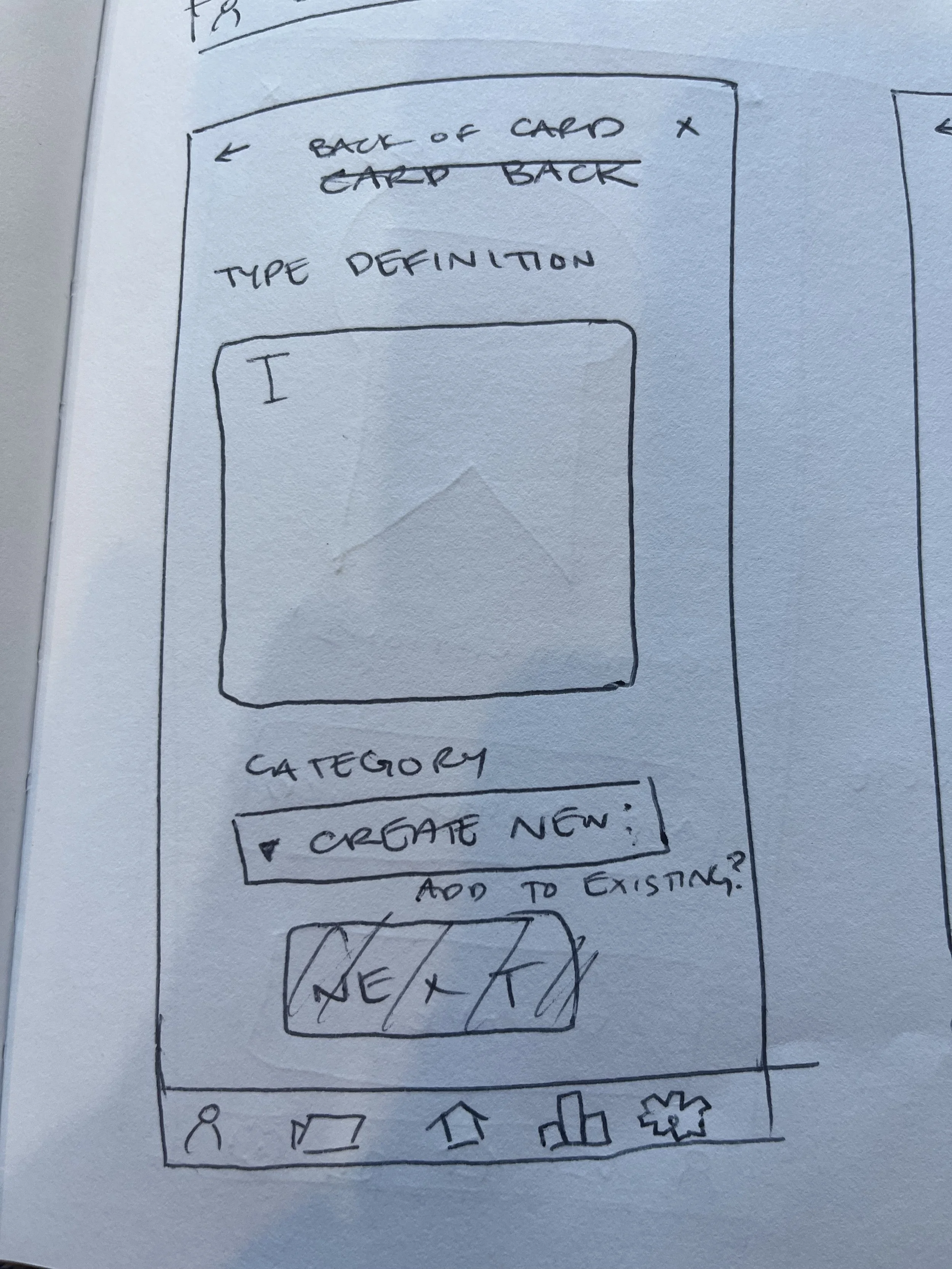
Task 2 Analysis: Create a New Flashcard
Open the app
Tap on “Flashcards”
Tap “Add New Flashcard”
Fill in
Word
Definition
Category
Optional Audio recording
Optional image upload
Add note? (can be done later as well)
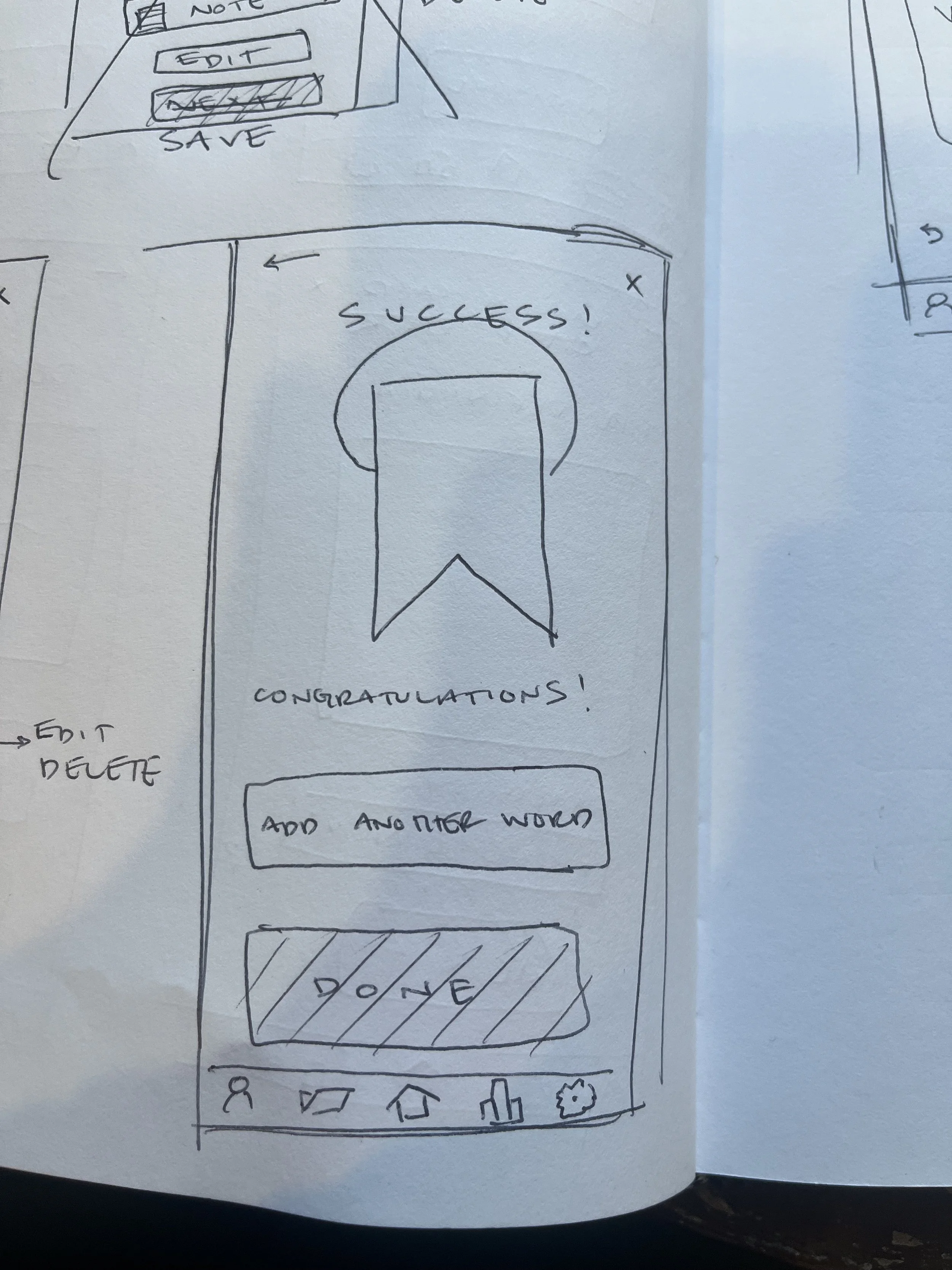
Tap “Save”
Return to “Flashcards”
Select category of recently created flashcard
Tap on new flashcard(s) to study
Tap on card to flip it (to the see definition or return to word prompt)
Tap on “Add Note” to add a note
Swipe left to keep it in the rotation
Swipe right if user has retained information
Go back to Homepage
User Flow: Task 2
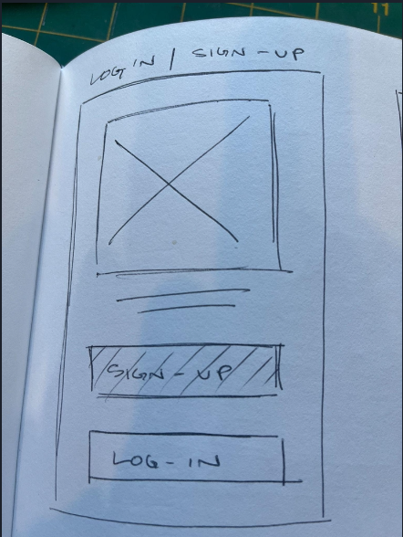
Step Five: Wireframing and Prototyping
After creating a persona and identifying the problem and primary tasks necessary to reach a possible solution, it was time to start sketching some wireframes and build a low-fidelity prototype for Jargon. Because I have a background in Studio Art, I decided to use that as the inspiration for the type of vocabulary words I would focus on for the wireframes and prototype.
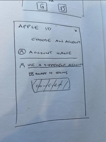
Login/Sign-Up Hand Drawn
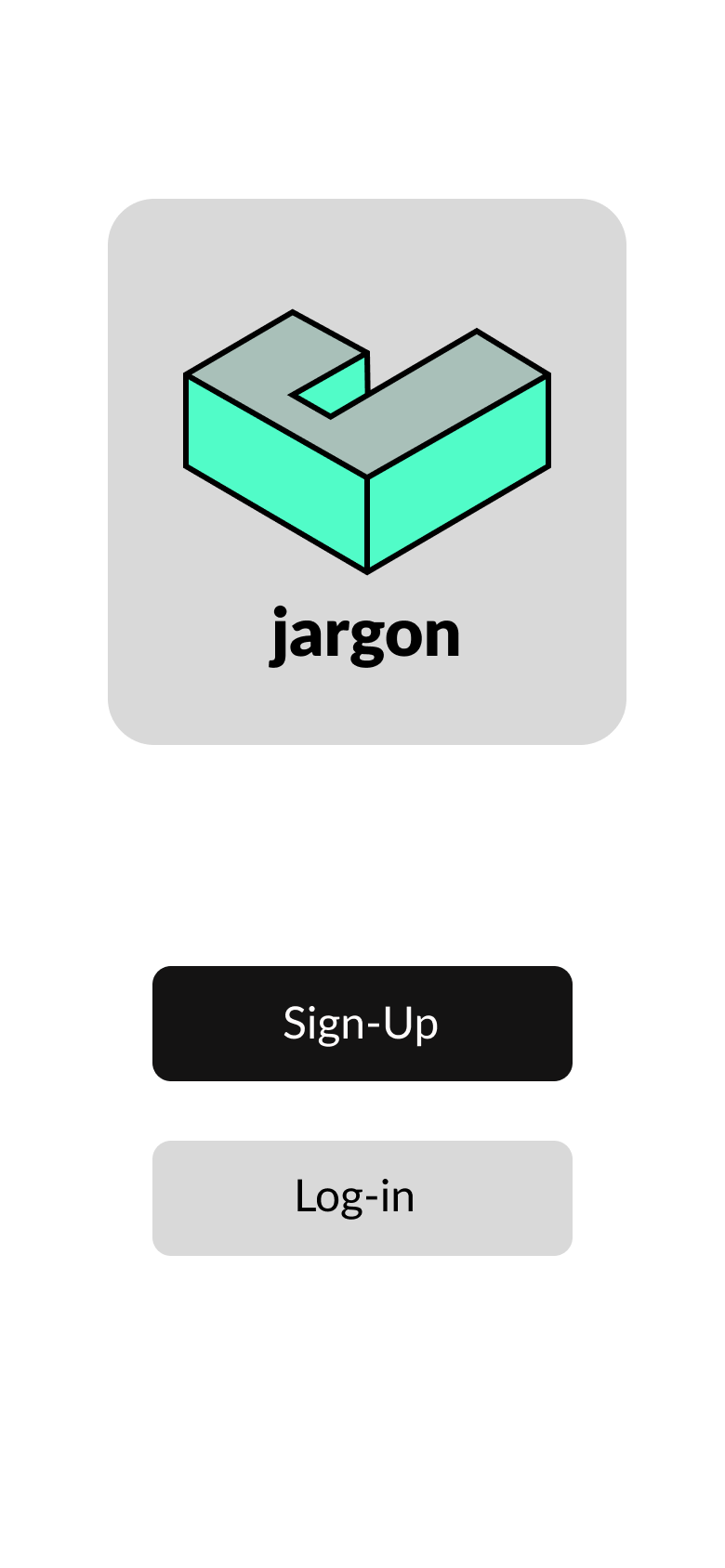
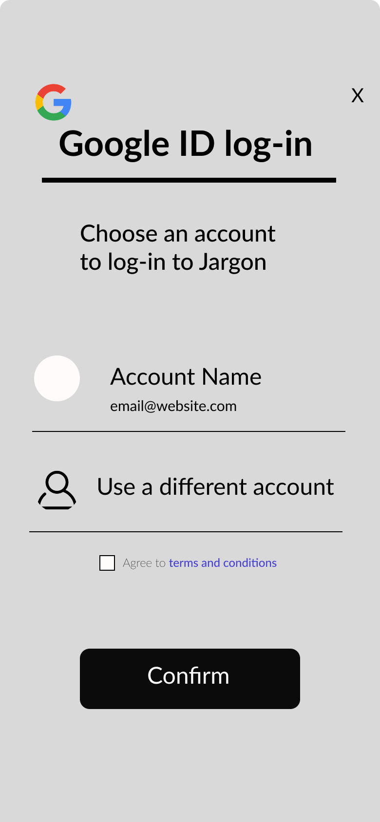
Login/Sign-Up Figma
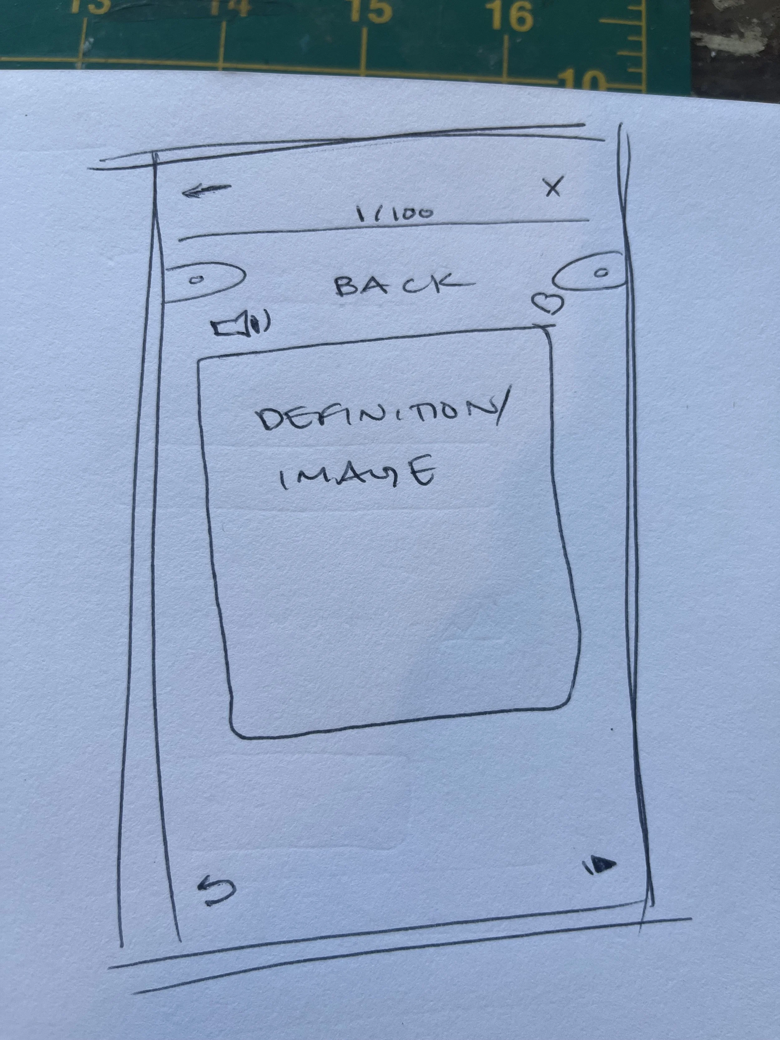
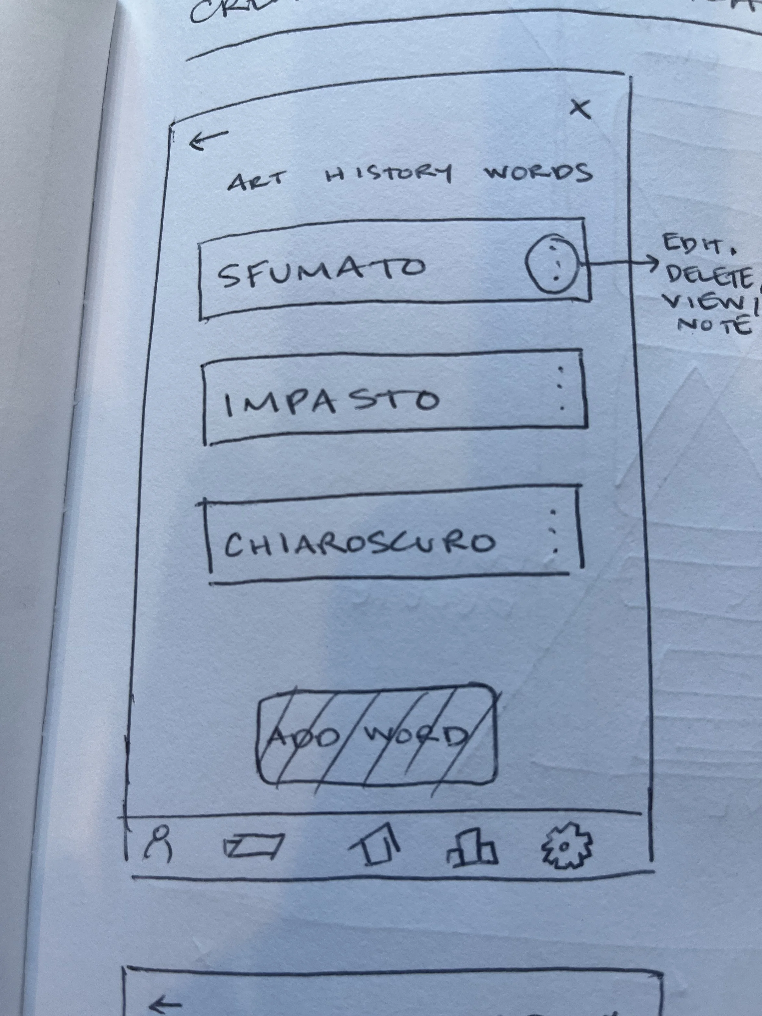
Create A New Card Hand Drawn
Create A New Card Figma
Step Six: Usability Testing
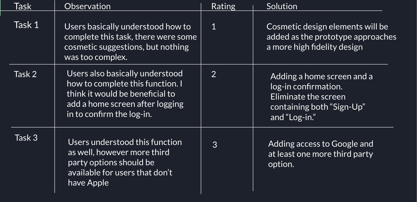
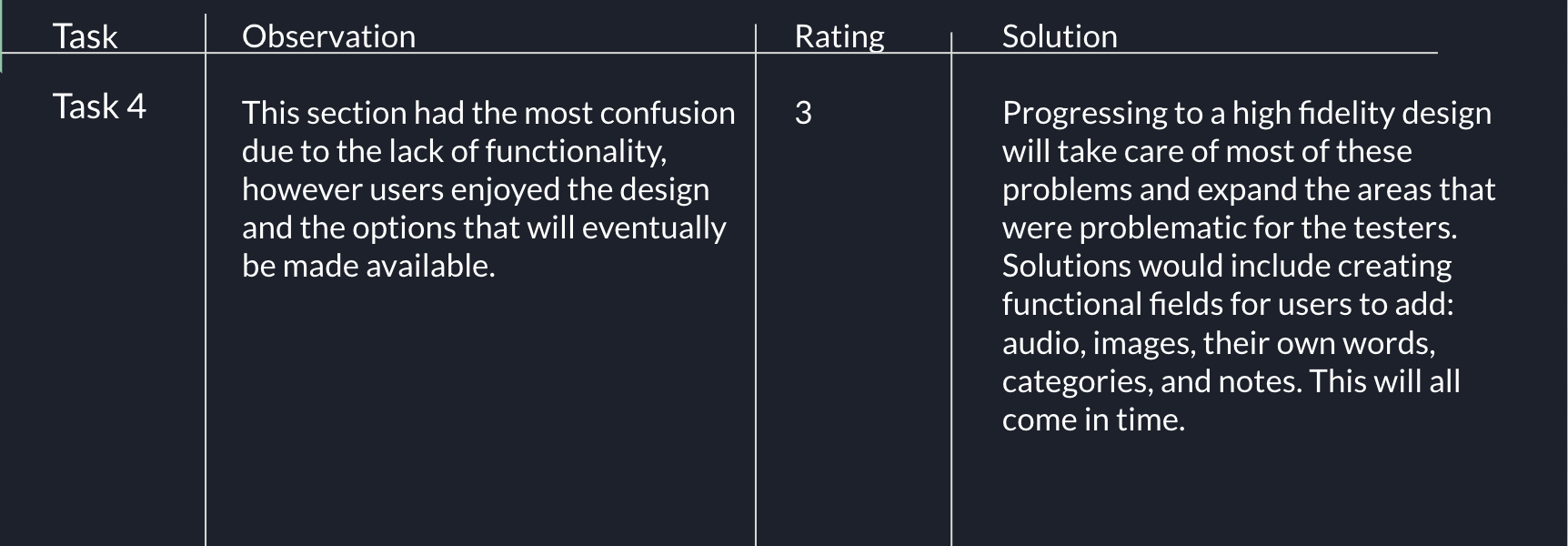
With templates provided by CareerFoundry, my next task was to create a usability test plan and script. I gave three participants the four same tasks to complete, while I observed them and took detailed notes on any issues they had. I then distilled my notes into a test report, rating the issues with Nielsen’s rating scale, and revisited my prototype to make any necessary updates and corrections.
Tasks:
You are coming to the app for the first time, sign-up
You have already signed up for the app, log-in
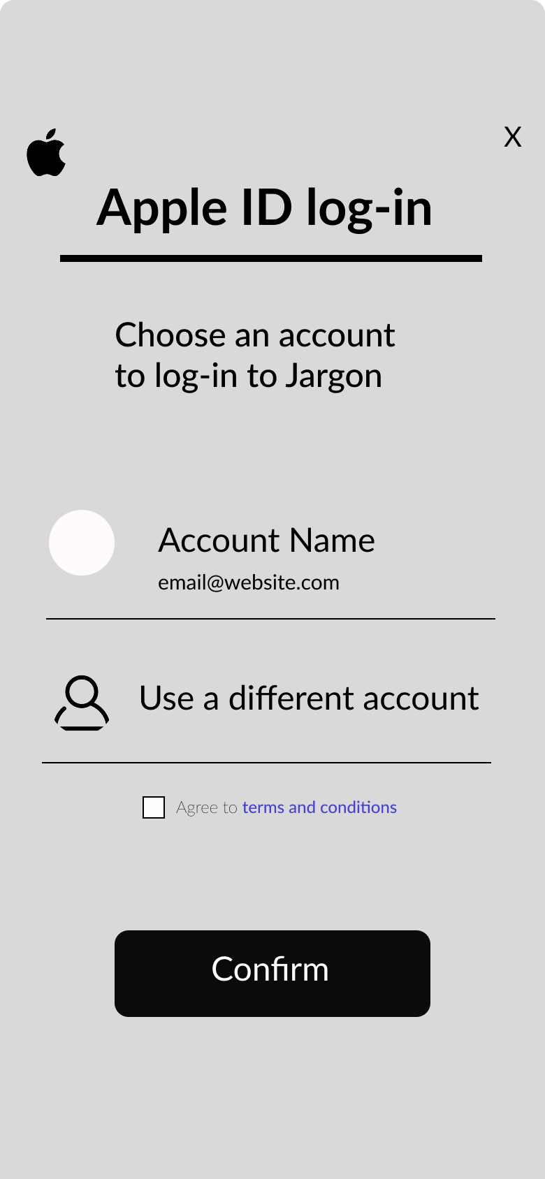
You want to sign in to the app using your apple ID
Imagine you have opened a list of words and want to add a new word to your study list
Participants & Interactions:
Participant 1:
Lauren, 38
Freelance project manager, works from home, some days are long and some days are short, this can be applied to work weeks as well. Usually has meetings in the early in the morning because clients are overseas.
Familiar with language learning apps like Duolingo, but not super familiar with flashcard apps.
Task 1: Easily found the sign-up button, confused by the lack of function of other fields. Pretended to enter email and password, felt confident with these functions. Suggested to add a home page after tapping “Sign-up.” Splash screen would benefit from some color and a logo.
Task 2: Completed function easily and knew that most of the buttons aren’t functional yet. Similar comments as above on how to improve this function.
Task 3: Enjoyed the animation of the screen coming from the bottom. Suggested adding more third party options such as Facebook or Linkedin.
Task 4: Liked seeing the icons at the bottom and stated that they are clear and understandable. Suggested adding a “plus sign” for quickly adding words. Again a little confused by the lack of function with other buttons/fields.
Participant 2:
Hugh, 36
Wood worker, work weeks vary, some weeks are slower than others, there is a lot of driving time for deliveries and installations. Familiar with language apps, though not a Flashcard app.
Task 1: Easily found Sign-Up button, said splash page could benefit from some “bells and whistles.” Wasn’t quite sure how to handle the lack of functionality at this stage of the prototype, but liked the overall look of the design. Suggested that “Log-In” and “Sign-Up” shouldn’t be on the same screen, splash page should look more like the “Log-in” screen, given that there is a “create account?” line.
Task 2: After completing task 1, task 2 was not a problem.
Task 3: Wanted to use Google as third party because he doesn’t use apple that much. Also suggested adding a few more options, but liked the simplicity of the icons.
Task 4: Also thought that there should be a home screen before entering into the “add a word” section. Thought the listed words could be a bit smaller, but liked the icon set at the bottom, added that they are “easily recognizable.” Curious about the add audio and add image options.
Participant 3:
Nik, 4o
Leather worker, works from home and takes each workday as it comes, sometimes there are orders to fulfill, sometimes not.
Familiar with language apps like Duolingo, but not so much with Flashcard style apps.
Task 1: Easily found the “sign-up” button, but again confused by the lack of functionality with the other buttons.
Task 2: Liked the simplicity of the “log-in” screen but said it would be nice if there was some “splashes of color.” Said it would be nice if you could actually tap “log-in” and it would confirm that you’ve logged into the app.
Task 3: Doesn’t have an apple ID or apple products, so thought the Google icon should be functioning. Enjoyed the simplicity of the third party log-in and liked the name “Jargon” for the app.
Task 4: Enjoyed simplicity of the add a word screen and the potential of creating a personalized deck of flashcards to study any subject. Wished there was more functionality to judge how easy it would be to add a word, or create a deck of flashcards. Also enjoyed the “success” screen to know that one has successfully added a card to the deck. Overall a little confused by the lack of function with most of the information presented. Asked about the note taking portion of the card and thought that it was a good idea.
Report & Next Steps:
Key Takeaways:
Refine accessibility and functionality for easier and higher engagement.
Be patient with the design process and usability testing.
Don’t get too far ahead in the design.
Think ahead, but don’t design ahead.