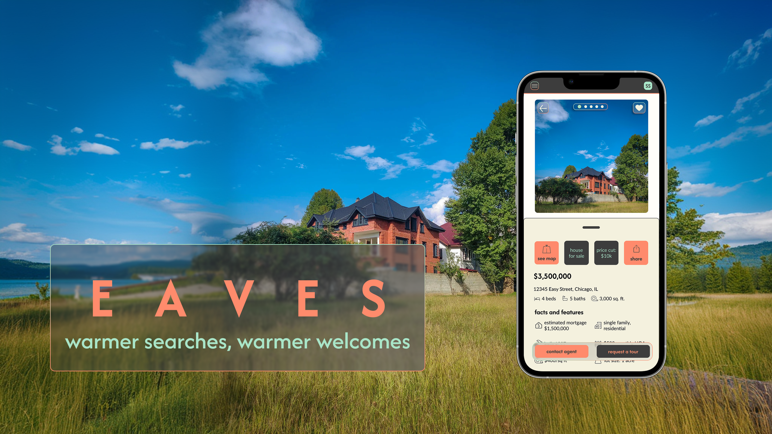
EAVES is a conceptual, responsive real estate application engineered to streamline multi-breakpoint property searches while managing user psychology. Recognizing that real estate transactions are high-stakes and inherently stressful, the platform utilizes a sophisticated, modular design system to establish a digital interface centered entirely on grounded wisdom, security, and comfort—directly mitigating cognitive load and user anxiety.
The Challenge
While real estate investment is a path to security, first-time buyers frequently struggle with information overload and a lack of professional guidance. To solve this, Eaves was designed as a responsive web application built on the principle of grounded expertise. The challenge was to transform a complicated search into a seamless journey, allowing users to define their own criteria and explore properties through an easy-to-use interface that values their time and builds their confidence.
The Approach
To build a foundation of trust for Eaves, I focused on the specific goals and pain points of the user persona. I designed with a philosophy of approachable expertise, tackling the most complex user journeys, like personal needs and deep-dive property views, first. Through iterative wireframing, I smoothed the transition into high-fidelity design, resulting in a secure, user-friendly experience across all devices
ROLE
Lead UI Designer (Concept)
CONTEXT
Independent Product Design Case Study
TOOLS
Figma | FigJam | Miro |
Mockuuups Studio | Angle Mockups | Pen & Paper
TIMELINE
November 2025 - February 2026
CORE FOCUS
Multi-Breakpoint Responsive Frameworks, Modular Component Libraries, UI Architecture, Visual Hierarchy
User Persona

RASHIDA
“I want to provide my family with financial security. I’ve been considering buying property for a while, and am looking for a tool that can help me find what I’m looking for, quickly!”
ABOUT:
Rashida is a busy IT consultant who wants to invest in property to support her family’s financial security. As a first-time buyer, she needs a simple, intuitive tool that helps her quickly search, filter, and save relevant listings without wasting time. She’s very tech-savvy and values simple and functional tools to allow her to make quick decisions.
GOALS:
Invest in property outside of the city to build financial security for her family
Wants to find accurate information for quick decisions
Wants a tool that shows properties that fit her best so she doesn’t waste her time
PAIN POINTS:
As a first-time investor, she lacks clear guidance on what to look for
She often wastes time reviewing listings that don’t match her criteria
Gathering enough information to make a confident decision takes too long
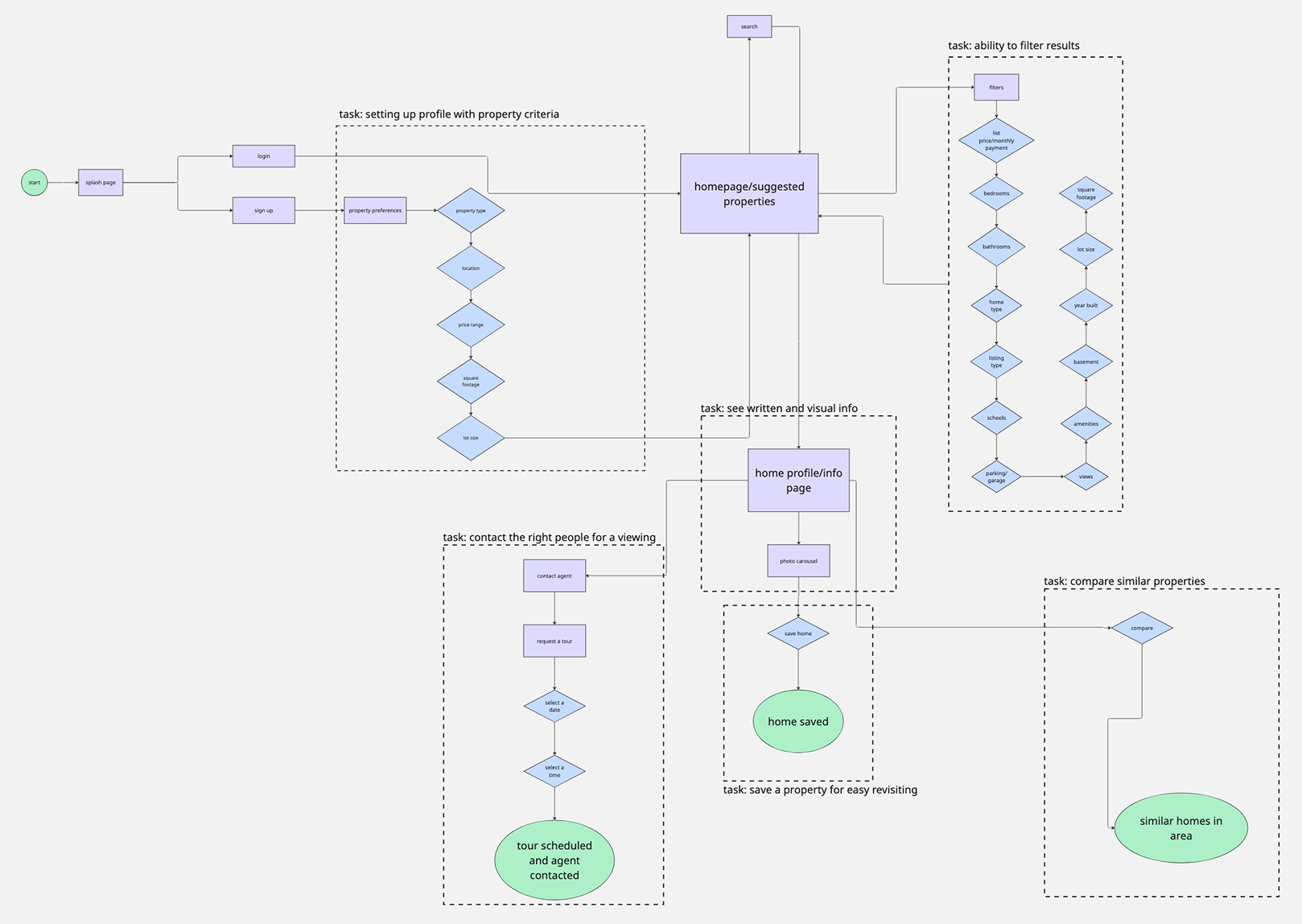
User Flows
To create a sense of digital shelter for Rashida, I carefully plotted the essential actions within her home-buying journey to minimize market noise. This flow demonstrates how Eaves simplifies the path from sign-up to agent contact, ensuring that filtering and exploring never feel like a chore. Whether navigating via the interactive map or diving into curated lists, the user is guided by an interface that prioritizes clarity, calm confidence, and a direct route to expert help
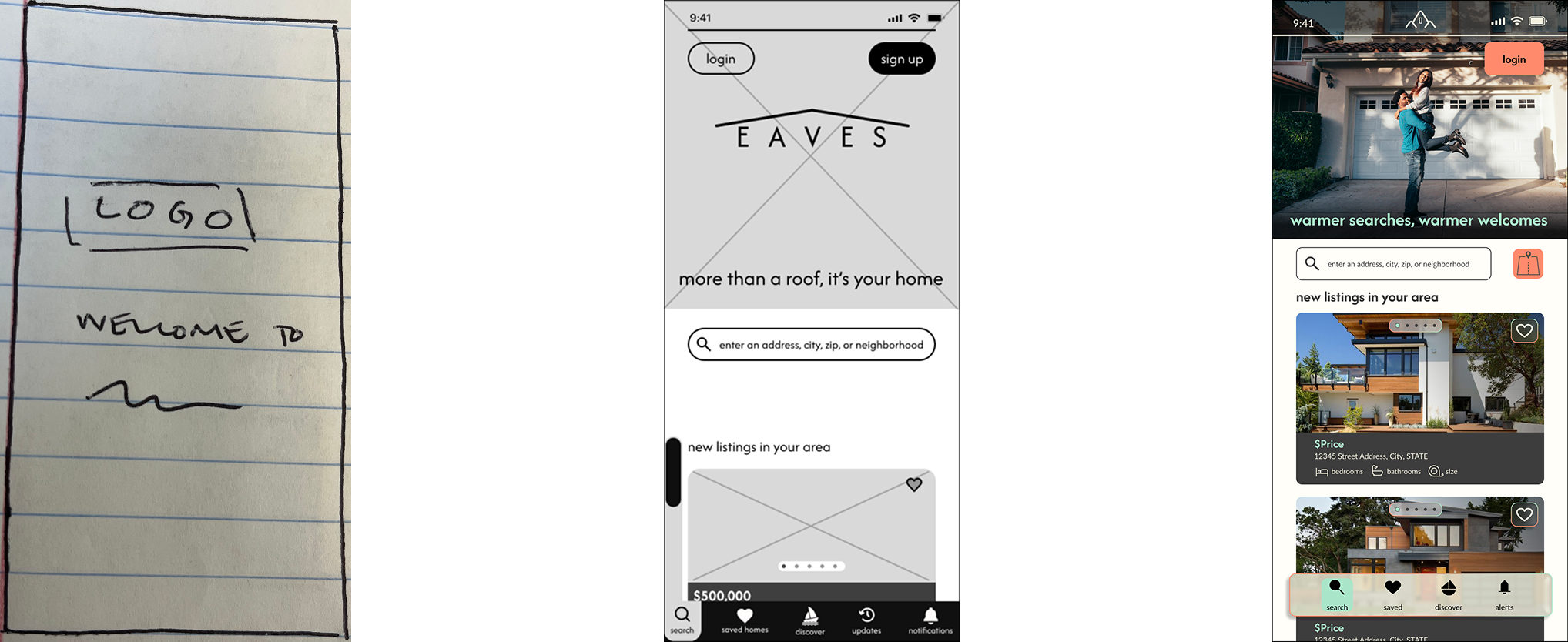
Wireframes
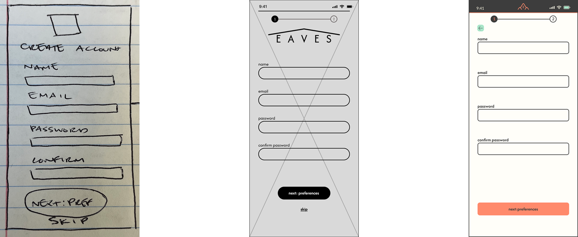
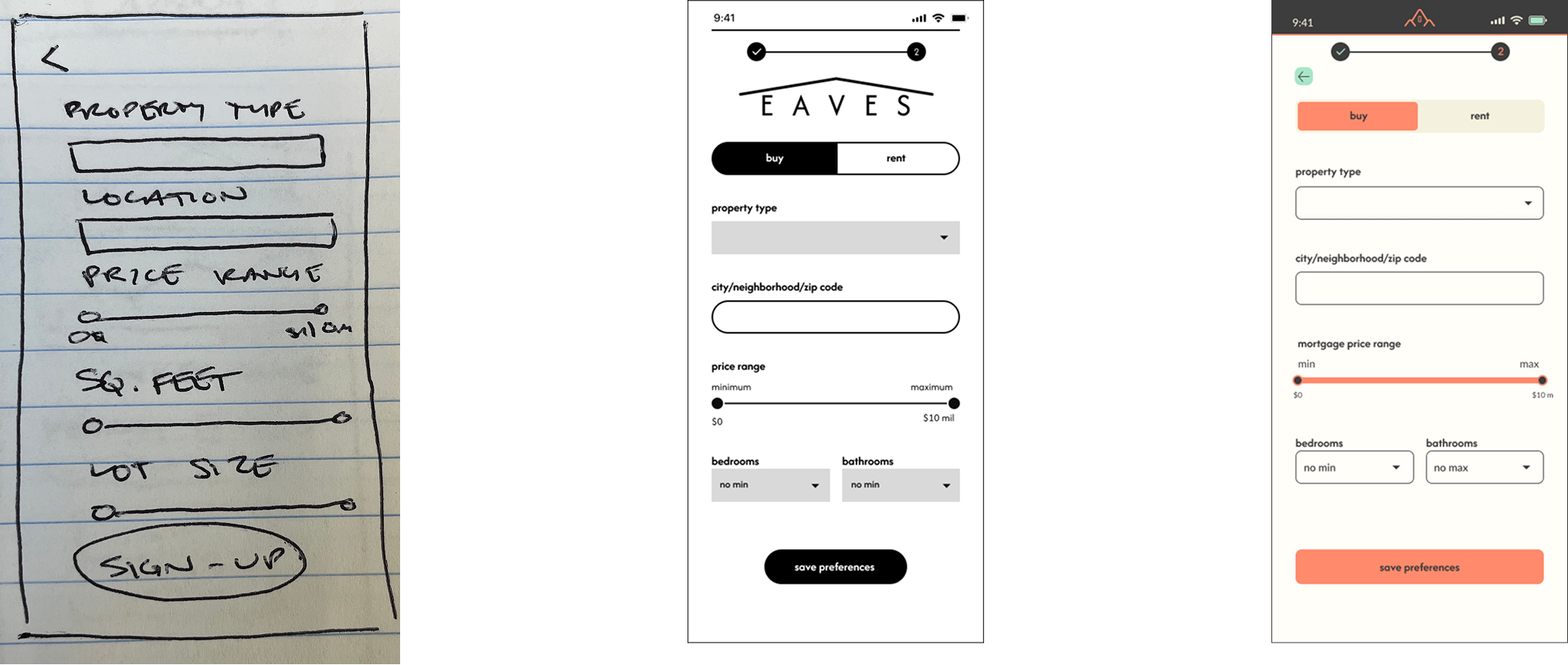
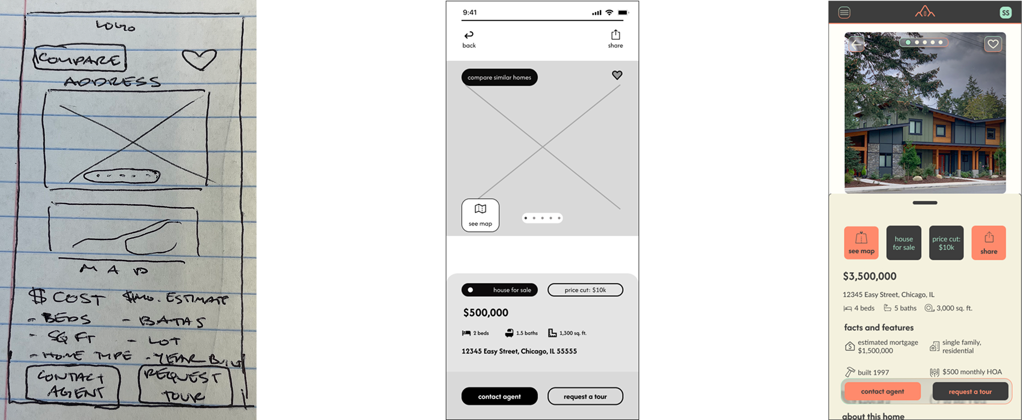
Once the path was set, I focused on bringing a sense of calm to the screen. I began with pen-and-paper sketches to explore different ways to present local insights, then transitioned to mid-fidelity wireframes to solidify the core experience. The final high-fidelity screens, infused with our warm terracotta and sage palette, show a clear evolution from a basic idea to a polished, inviting digital environment. This progression demonstrates a commitment to making every interaction feel steady and secure.
Landing Page
Create Account
Initial Filters
Home Information
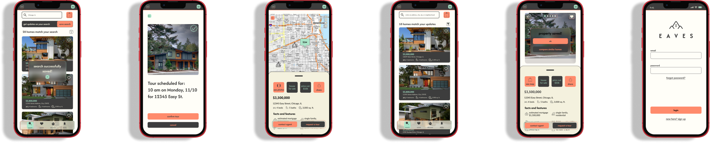
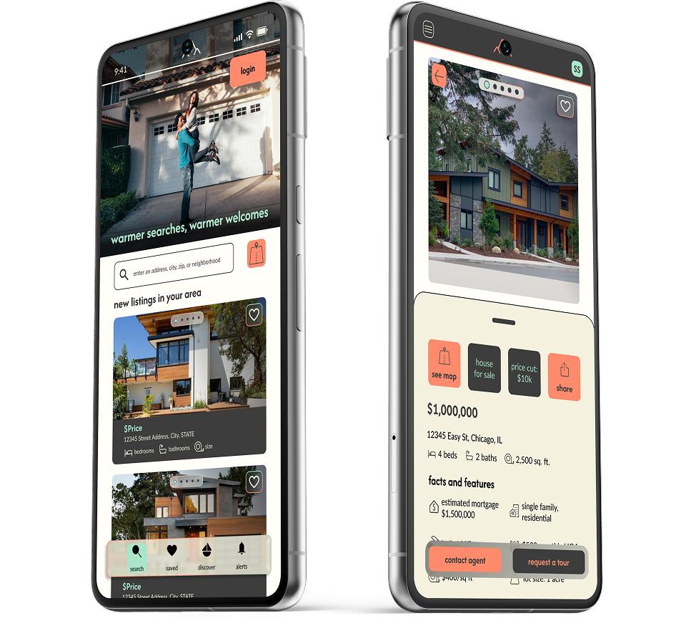
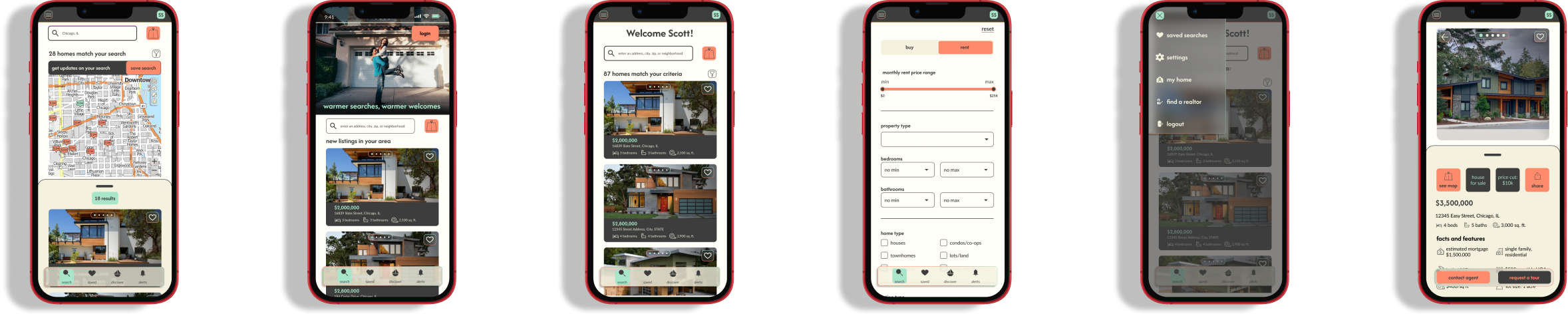
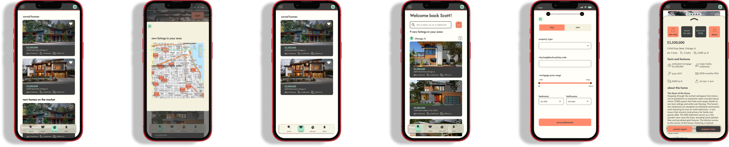
High-Fidelity Mobile Mockups
Mood Board
To guide the high-fidelity design, I curated a mood board inspired by the concept of "Shelter;" a space that feels intentional, grounded, and deeply reassuring. Recognizing that the property search can often feel chaotic, I leaned into a palette of organic sage and warm terracotta to foster an immediate sense of security and to set the app apart from competitors like Zillow and Trulia. The visual direction prioritizes calm through airy compositions and softened, rounded UI elements that feel approachable rather than clinical. By pairing concise, wise copy with friendly, intuitive iconography, the design ensures that users feel supported by a trusted guide rather than overwhelmed by an algorithm.
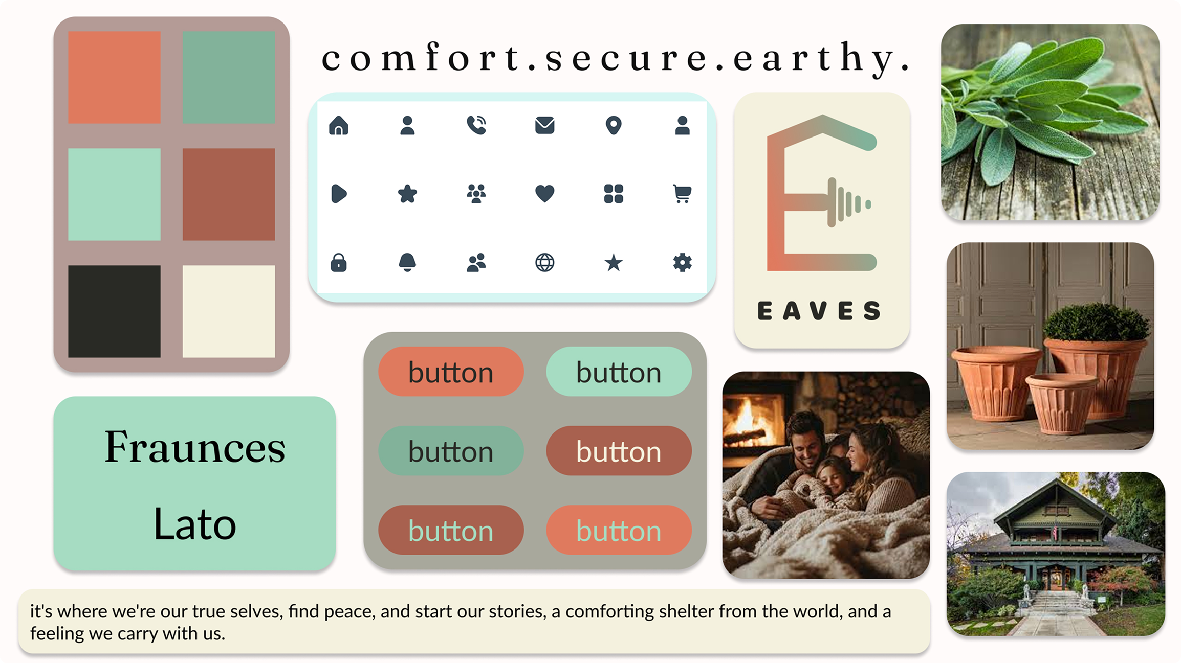
Style Guide
This style guide provides the essential framework for the Eaves visual identity, covering everything from our signature terracotta tones to our supportive typography. It captures the calm, secure, and user-centered aesthetic that helps buyers cut through market noise. By following these standards, designers and leads ensure that the Eaves experience remains a seamless and trustworthy sanctuary for every user, on every device.
Logo
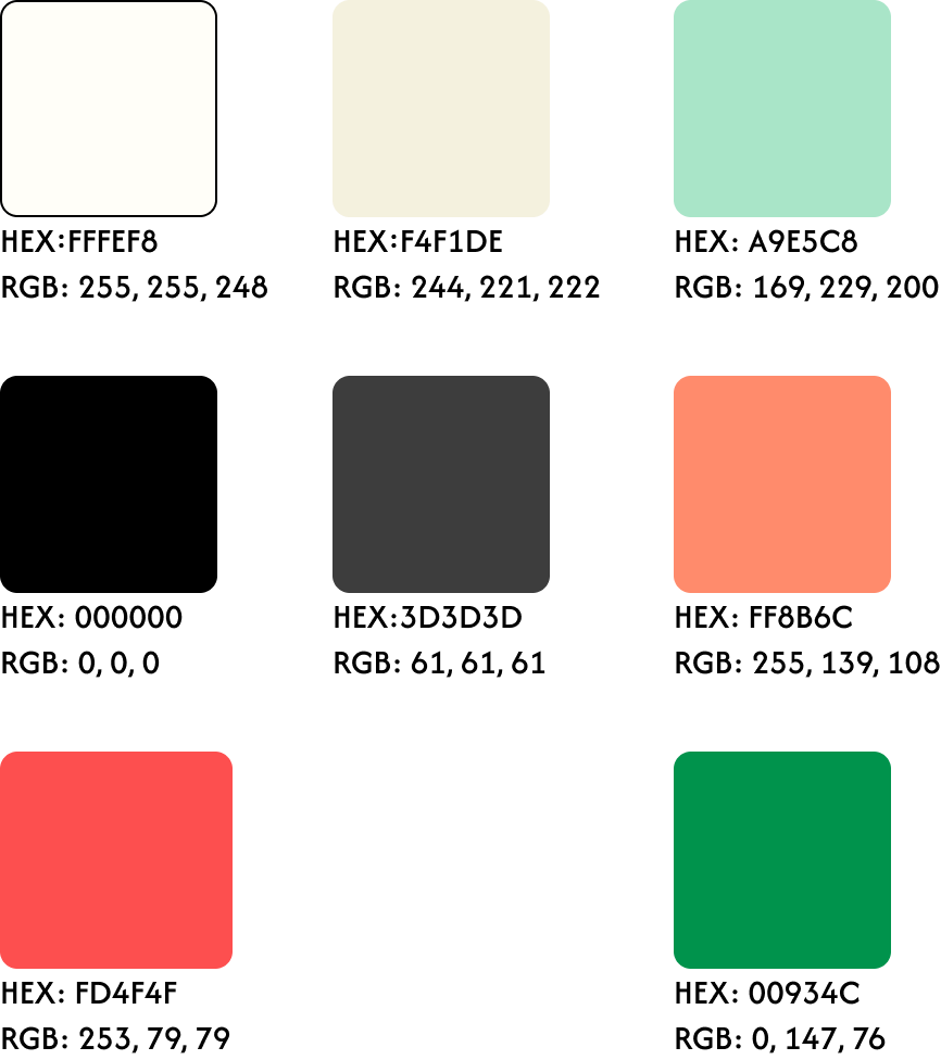
Color
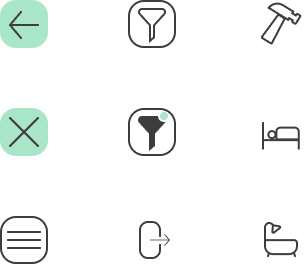
Iconography
Cards
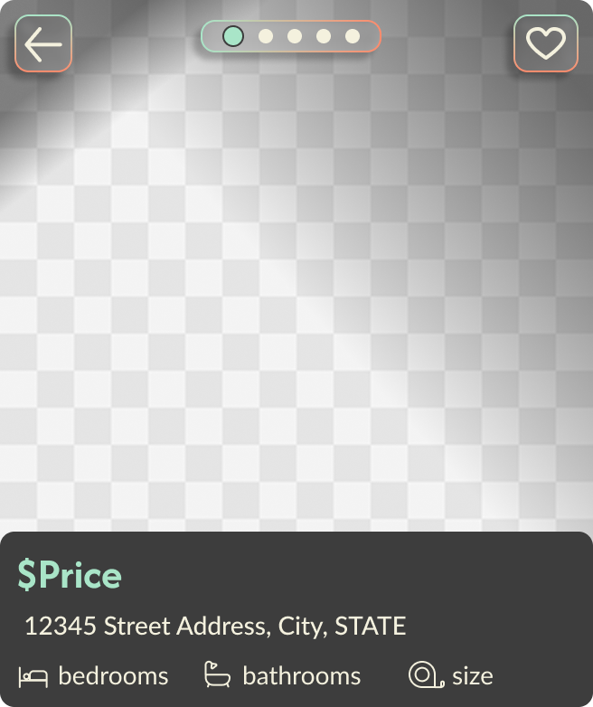
House Info Page Card
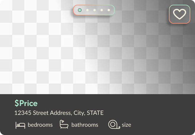
List Page Card
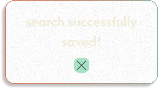
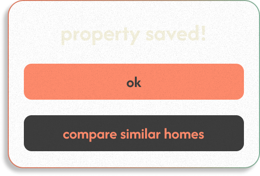
Saved Search Overlay
Saved Property Overlay
Components
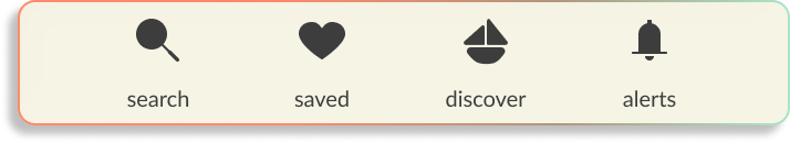
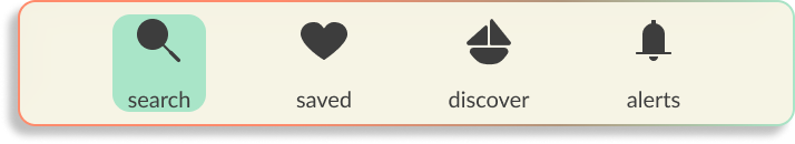
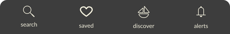
Mobile Bottom Navigation
light/glass
dark mode

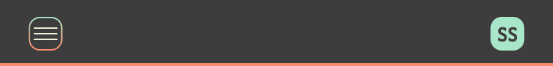
Mobile Top Navigation
Buttons


Buy/Rent Toggle


Responsive Design
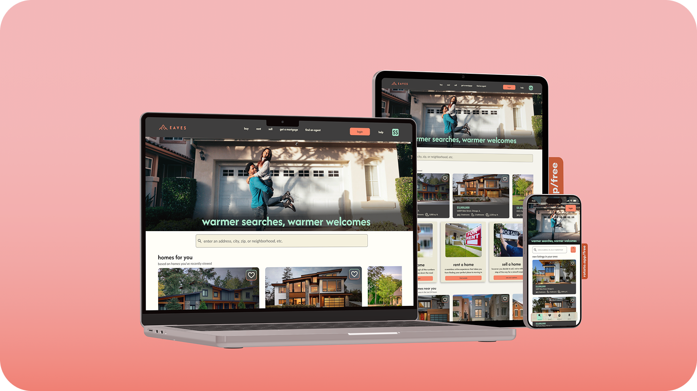
I optimized the Eaves layout across three key breakpoints to ensure our 'grounded wisdom' is accessible whenever and wherever it's needed. By adapting the core components for mobile, tablet, and desktop, I created a seamless transition for users like Rashida who balance their property search with a busy life. Whether she’s scouting a street corner on her phone or comparing data on her desktop, the design remains consistent, reliable, and easy to navigate.
Reflection
Designing Eaves was an exercise in balancing technical precision with emotional intelligence. I strengthened my ability to translate a user’s need for security into a series of calm, intuitive flows. This project deepened my mastery of responsive design, teaching me how to maintain a grounded feel even as layouts shift across breakpoints. Ultimately, I learned that the most intentional high-fidelity decisions are rooted in the freedom of early, low-fidelity exploration, allowing the brand’s wisdom to grow naturally from sketch to screen.
Improvements
My goal for future work is to further validate my design intuition with earlier rounds of moderated feedback. By bringing the user's voice into the process sooner, I can ensure a more polished final product. I also intend to sharpen my documentation style, turning design rationale into a strategic asset that helps stakeholders and developers align quickly and confidently with the project’s vision.
Scalability
The Eaves design system is engineered as a living blueprint, built to evolve alongside our users. Its modular components and rhythmic typography provide a stable foundation that can naturally extend into future features like neighborhood 'vibe-checks' or real-time agent consultations. As we expand the Eaves ecosystem, our responsive framework ensures that this growth never compromises the visual clarity and grounded sense of home our users rely on.